DIGITAL FOUNDATIONS | BUILDING CMS WEBSITES and designing digital content AT TCDS
Role: Website Designer & Digital Content Specialist
Duration: Dec 2024 - Present
Tools Utilized: Canva, Adobe Creative Cloud, Shopify, Squarespace, Civic Plus, Figma, Elementor
Project Type: CMS Website Process, End-to-End Design, Graphic Design
At Treehouse Creative Digital Solutions, I design and develop content-driven websites that transform complex information into clear, accessible digital experiences. My role spans strategy, wireframing, visual design, and full CMS implementation, with a focus on scalable structure, usability, and consistency.
This case study highlights a selection of websites I’ve built during my time at the company, showcasing my approach to content architecture, system design, graphic design, and end-to-end execution.
Website Brand Guides
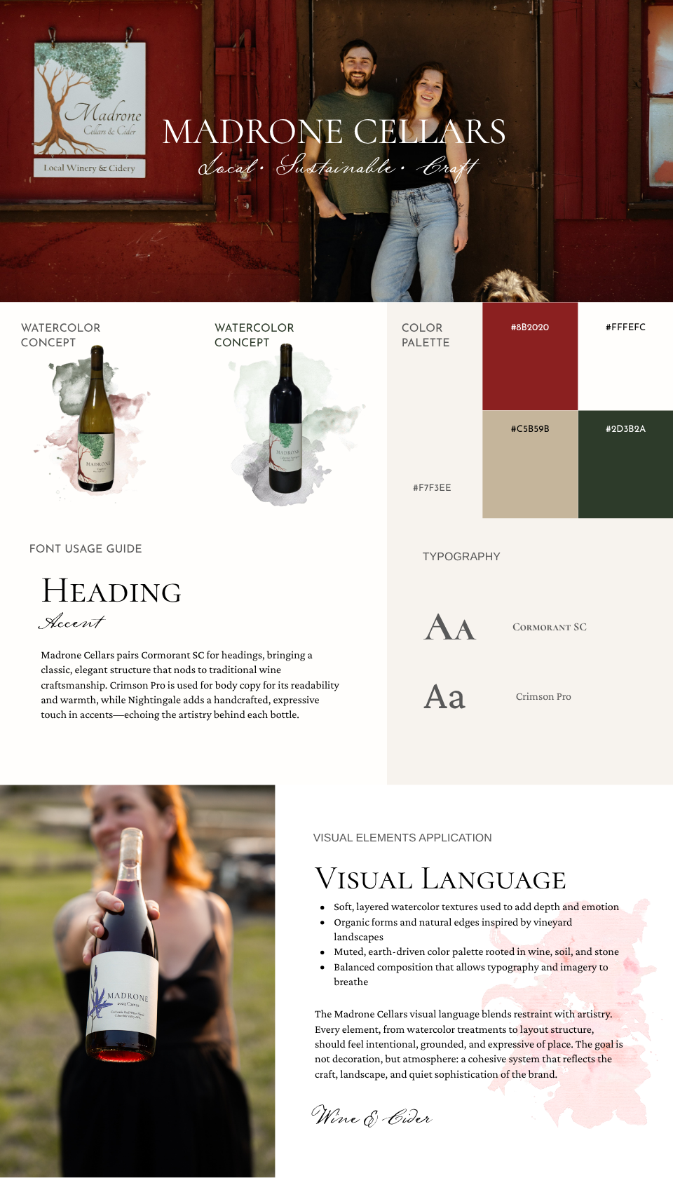
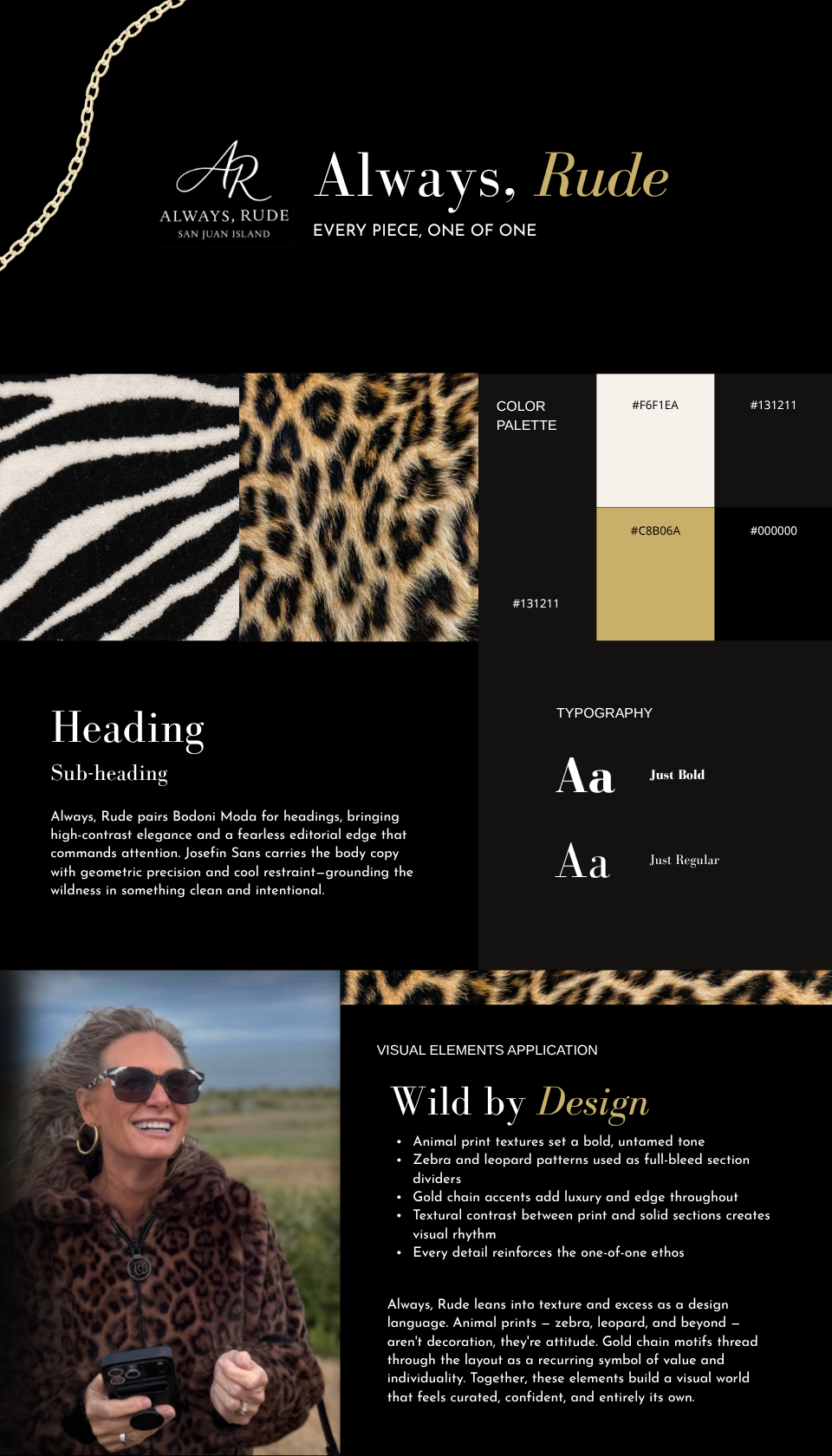
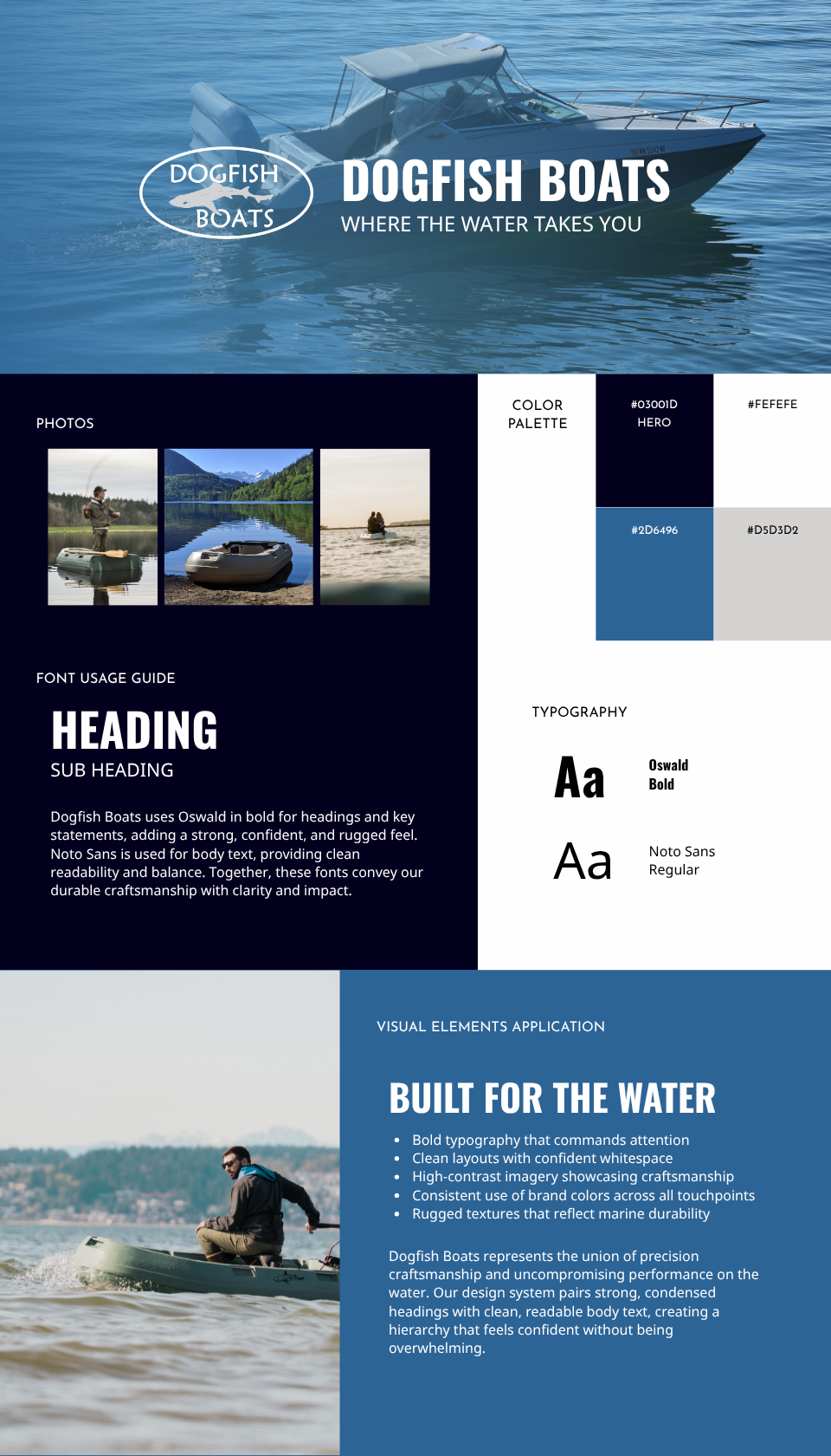
For each client, I develop a brand guide using Adobe InDesign that establishes a cohesive visual identity, ensuring consistency across digital, print, and marketing materials.
Client Logos
Designed in Adobe Illustrator

Town of Friday Harbor - Redesigning a Municipal Website for Clarity, Accessibility, and Community Trust
Dec ‘25 - May ‘26
Overview
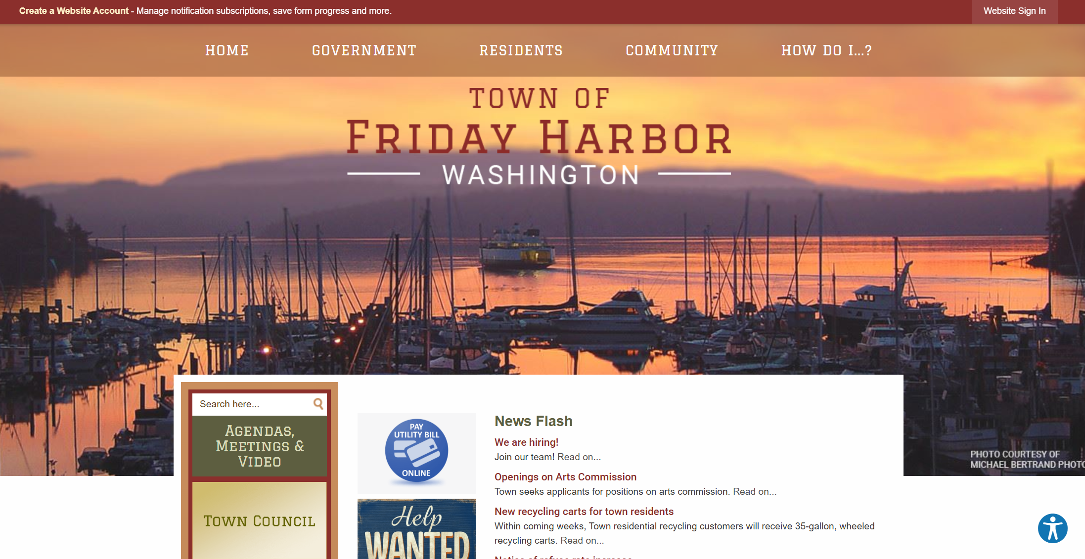
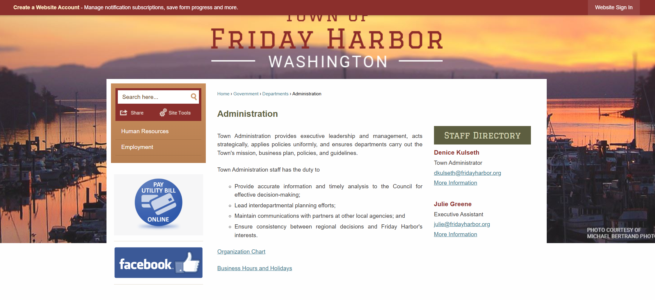
The Town of Friday Harbor's official website serves as the primary digital resource for residents, businesses, and visitors seeking access to public information, services, and community resources. The previous website's outdated information architecture, inconsistent layouts, and fragmented navigation made it difficult for users to quickly locate important content and complete common tasks.
I led the branding, design, and redevelopment of the website using CivicPlus, a municipal content management system, creating a more intuitive, accessible, and user-centered digital experience. I restructured the site's information architecture, streamlined navigation, and developed a consistent content framework to improve usability and support long-term content management. Throughout the project, I partnered closely with Town stakeholders to ensure content accuracy, align the website with operational priorities, and support accessibility best practices while delivering a scalable public-facing platform that now serves more than 2,000 visitors each month.
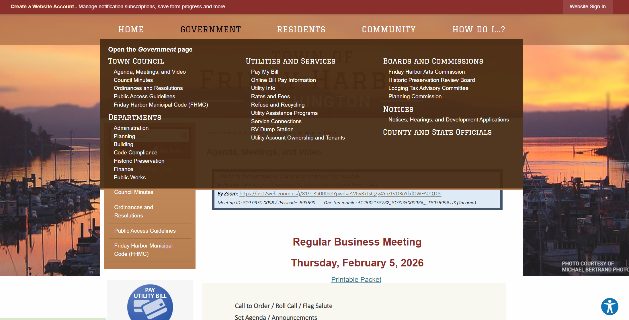
The Old Website
Problem
The existing website presented several usability challenges:
Disorganized information architecture with unclear content hierarchy
Navigation that made key public services difficult to locate
Inconsistent layouts across departments
Outdated visual identity that did not reflect the town’s character
Legacy content that lacked structure and clarity
For a municipal website, these issues directly impact trust, accessibility, and civic engagement.
My Role
Led the branding, information architecture, and redevelopment of the Town's municipal website from discovery through launch using CivicPlus.
Conducted a comprehensive content audit and reorganized legacy content to improve usability, accessibility, and long-term content management.
Designed a scalable information architecture, sitemap, navigation, and page templates to create intuitive user experiences and support efficient content publishing.
Developed the website's visual identity, branding system, and accessible design standards to ensure a consistent public-facing experience.
Collaborated directly with Town leadership to gather requirements, coordinate content updates, and ensure information remained accurate, user-focused, and aligned with community priorities.
Continued supporting post-launch website maintenance, content updates, and stakeholder requests to keep the site current and effective.
Information Architecture & Sitemap Redesign
Before designing visuals, I focused on structure.
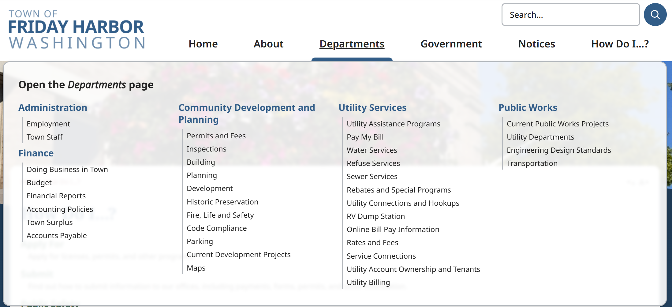
I conducted a full content audit to understand how information was currently categorized and where users experienced friction. Working with administrative stakeholders, I restructured the site into a more intuitive, task-based hierarchy that prioritized:
Home
About
Departments
Government
Notices
‘How Do I’ resources
The result was a simplified sitemap that reduced redundancy and clarified relationships between departments.
Visual Identity and Color Palette
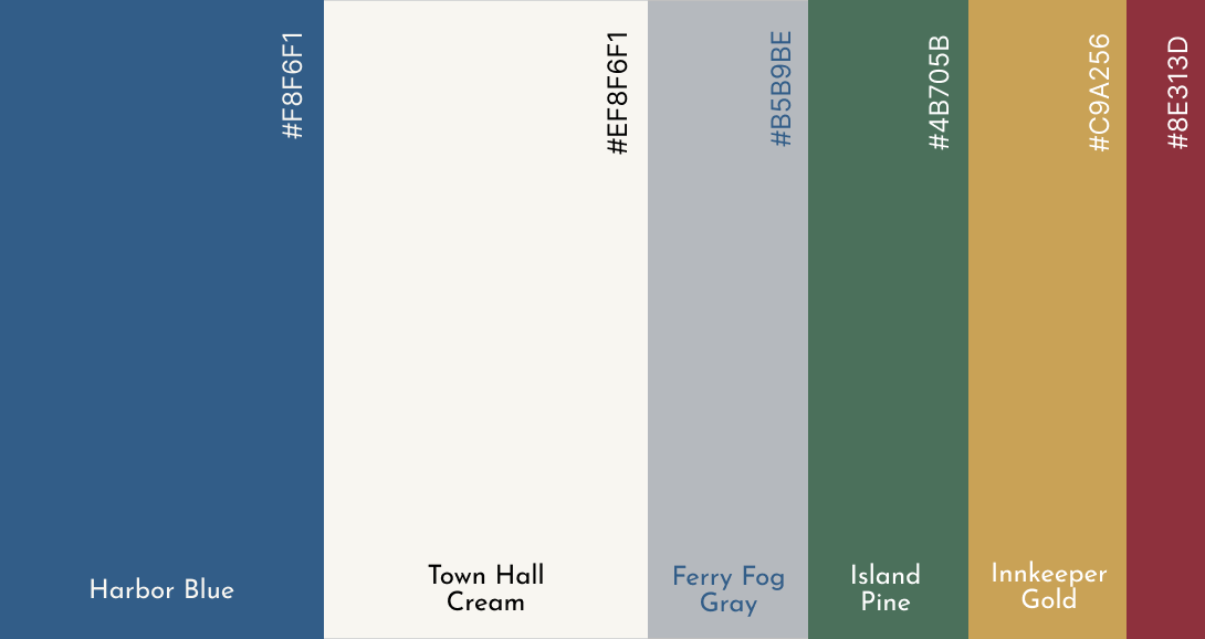
The redesign included the development of a refreshed color palette that:
Reflects the coastal character of Friday Harbor
Maintains strong accessibility contrast standards
Creates visual consistency across announcements, buttons, and call-to-actions
The updated visual system balances professionalism with warmth, reinforcing trust while reflecting the town’s identity.
Content Migration & Refinement
A major component of this project involved:
Transferring legacy content into the new CMS structure
Rewriting and refining copy for clarity and consistency
Eliminating outdated or redundant information
Improving content hierarchy to support scanability
This process required close coordination with administrative staff to ensure regulatory accuracy and alignment with public communication standards. I would attend and lead weekly meetings with staff to ensure that outcomes aligned with their vision for the new website.
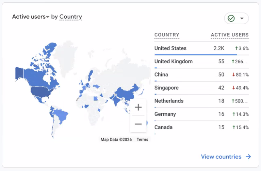
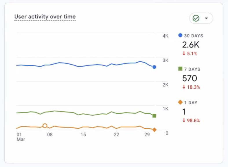
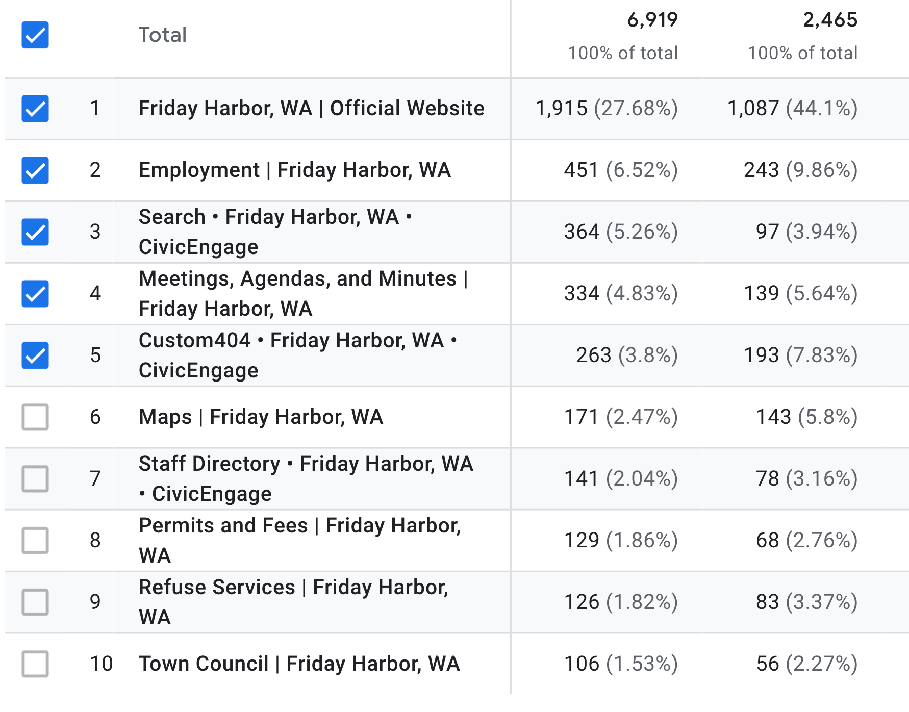
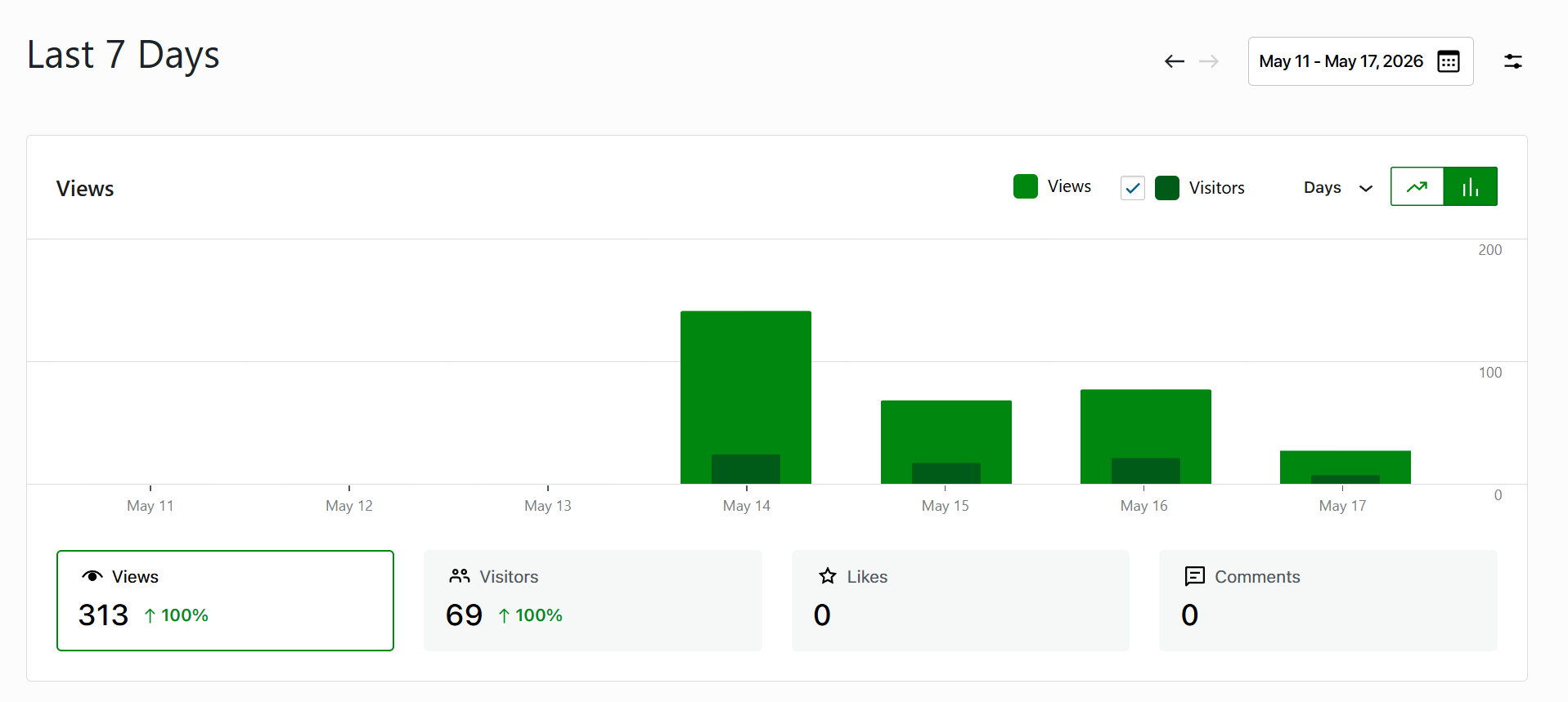
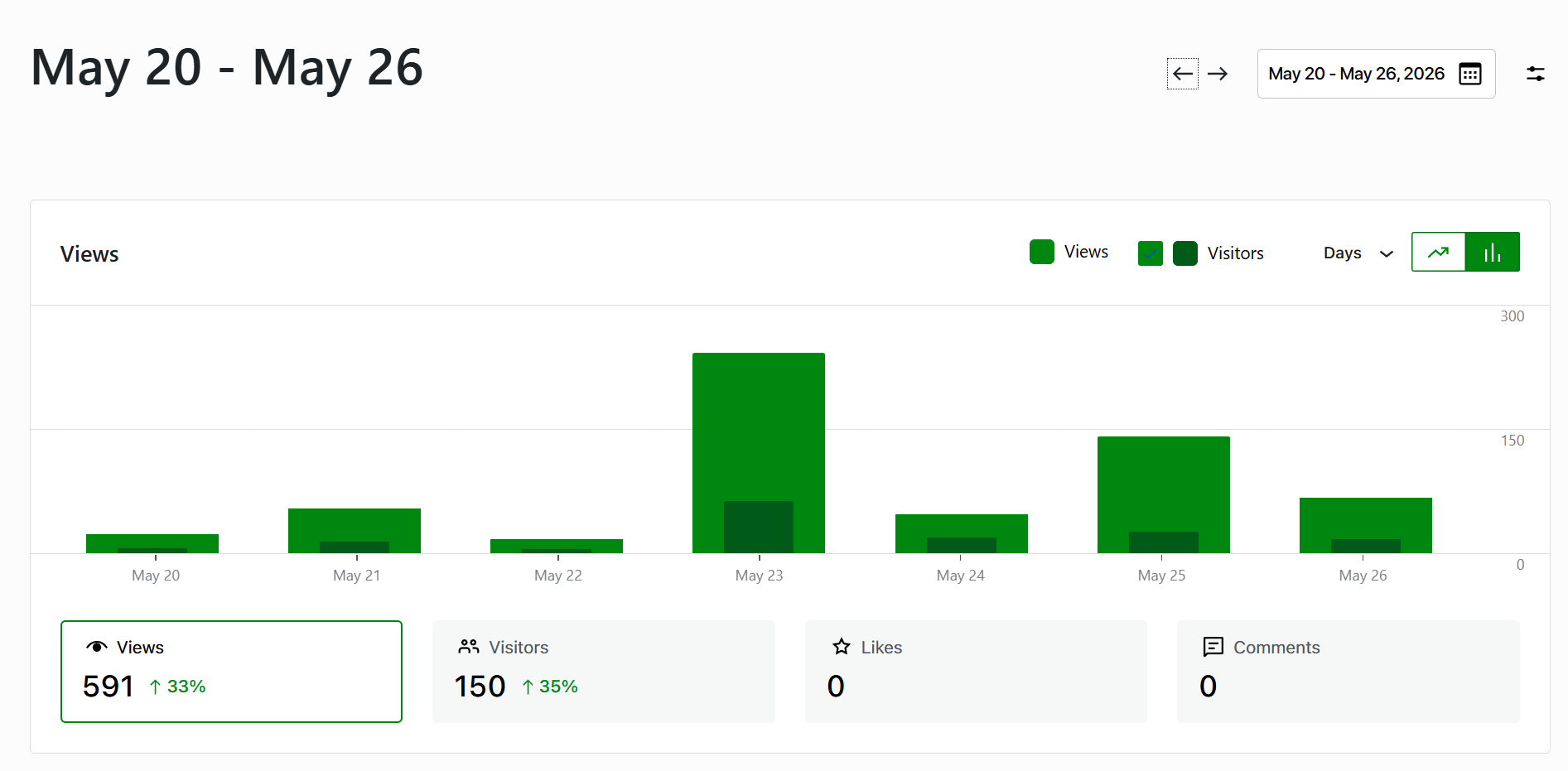
Google Analytics
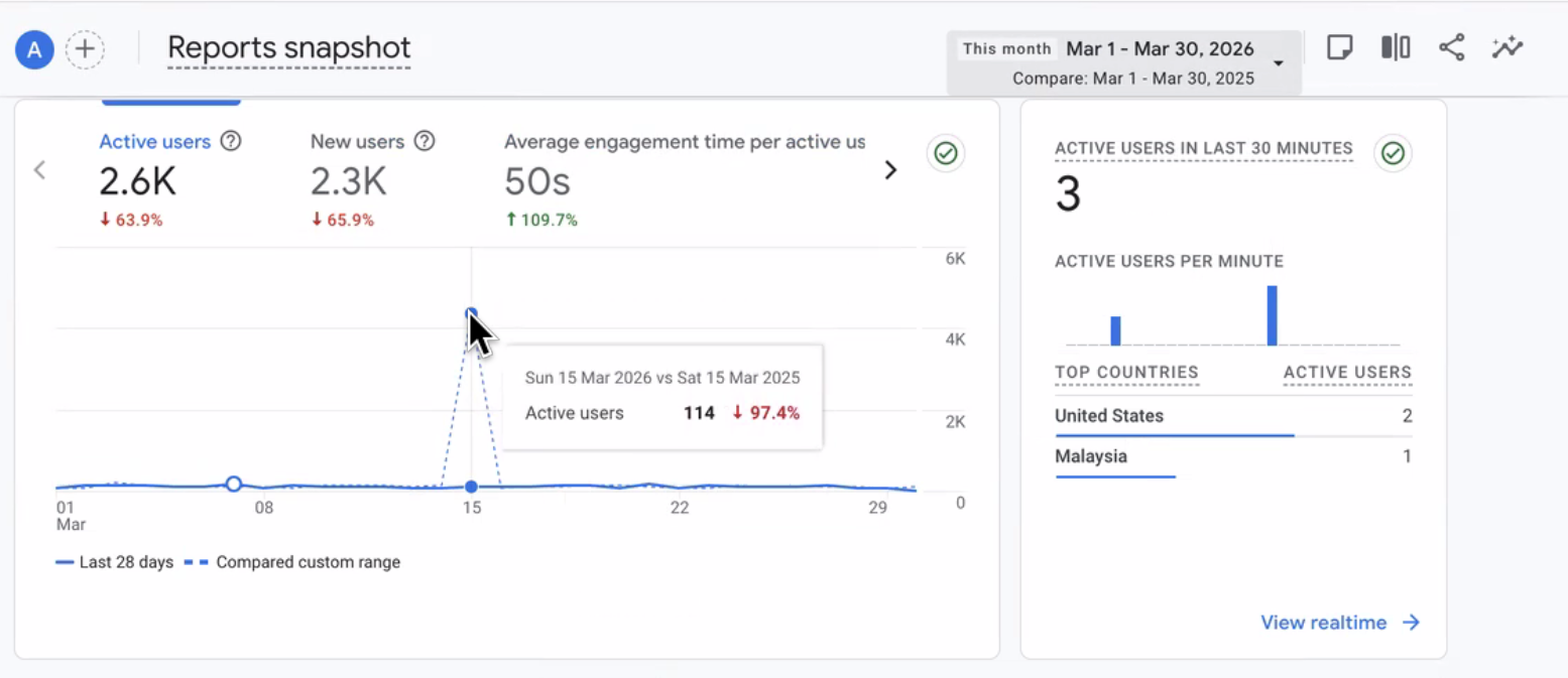
I studied user behavior through Google Analytics to identify trends in engagement and areas for improvement. I applied these insights to optimize content structure and interactions, enhancing user retention and reducing bounce rates.
June 2026
Reseach & Quality Assurance
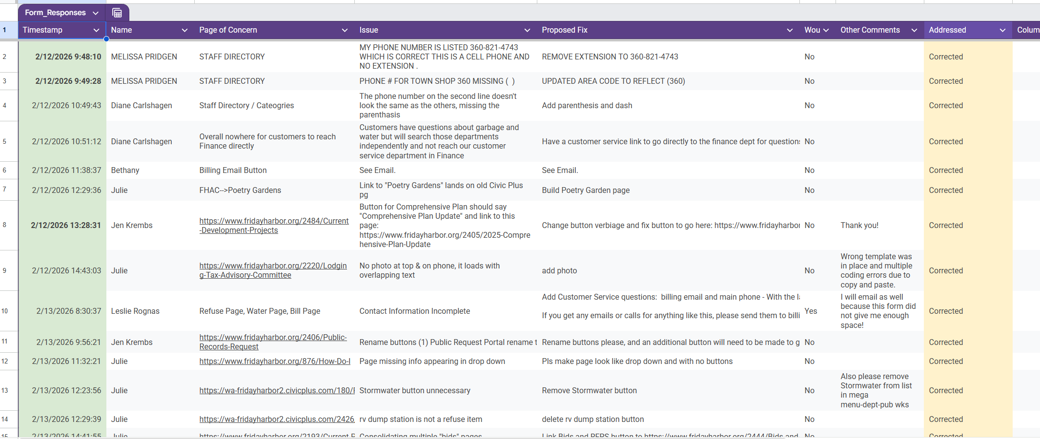
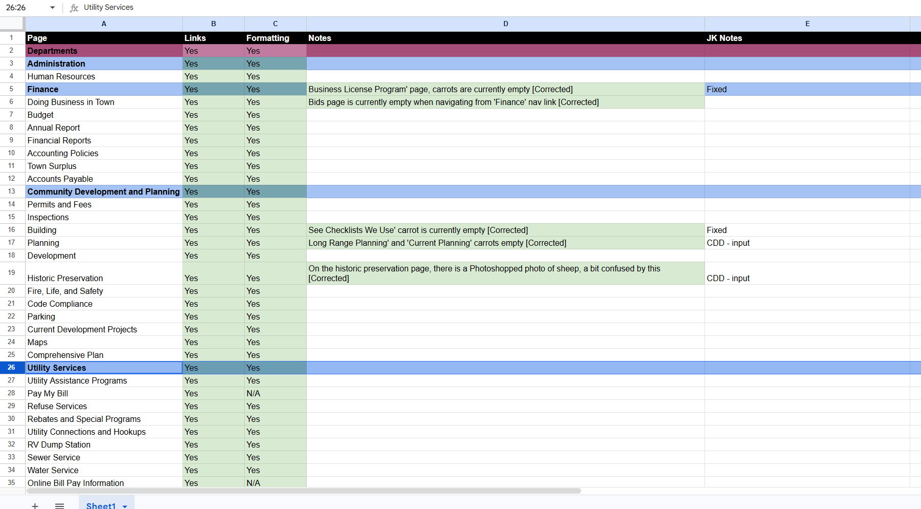
To inform design decisions, I developed and distributed a Google Form to gather user feedback and identify usability gaps. I analyzed response patterns and key insights, then translated those findings into structural and visual improvements within the site.
Following implementation, I conducted a comprehensive page-by-page quality assurance review to ensure consistency, functionality, accessibility, and content accuracy across the entire platform prior to launch.
outcome
The redesigned website provides a more accessible, user-centered digital experience that makes it easier for residents, businesses, and visitors to find the information and services they need. Key improvements include:
Streamlined navigation and information architecture for faster access to public services
Improved content organization and consistency across departments
Enhanced accessibility and responsive design to better serve all users
A cohesive visual identity that strengthens trust and reinforces the Town's brand
A scalable CivicPlus content management system that supports long-term maintenance and future growth
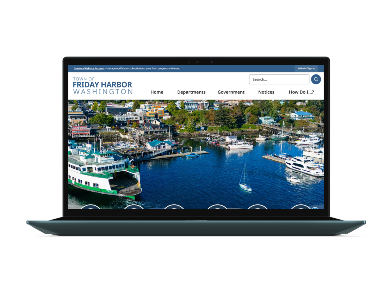
Today, the website serves more than 2,000 visitors each month and continues to evolve through ongoing collaboration with Town stakeholders. By improving usability, accessibility, and content management, the new site has become a more effective and reliable digital resource for the Friday Harbor community.
More Website Projects
In addition to the featured case study, I’ve collaborated on a range of website projects over the past year across different industries and CMS platforms.
The following sections highlight select projects where I contributed to design, development, content strategy, SEO optimization, and layout implementation — each tailored to the client’s unique goals, brand identity, and audience needs.
DOGFISH BOATS — FULL WEBSITE REBUILD FOR A BELLINGHAM BOAT COMPANY READY TO SELL ONLINE
May 26’ - Jun 26’
Overview
Dogfish Boats is a Bellingham, WA manufacturer of rugged rotomolded boats. Their site was broken — PHP errors, outdated hosting on Network Solutions, and a checkout that silently redirected customers to a separate Squarespace store, costing them sales and trust.
I rebuilt the entire site from scratch: migrated to Bluehost, redesigned all eight pages in WordPress with Elementor Pro, and replaced the disconnected Squarespace store with a fully integrated WooCommerce checkout. I developed new branding to match the company's identity and launched the site the day before the Bellingham Boat Show. Post-launch, I implemented SEO and AEO practices to help the site get found — including in AI-powered search.
The Problem
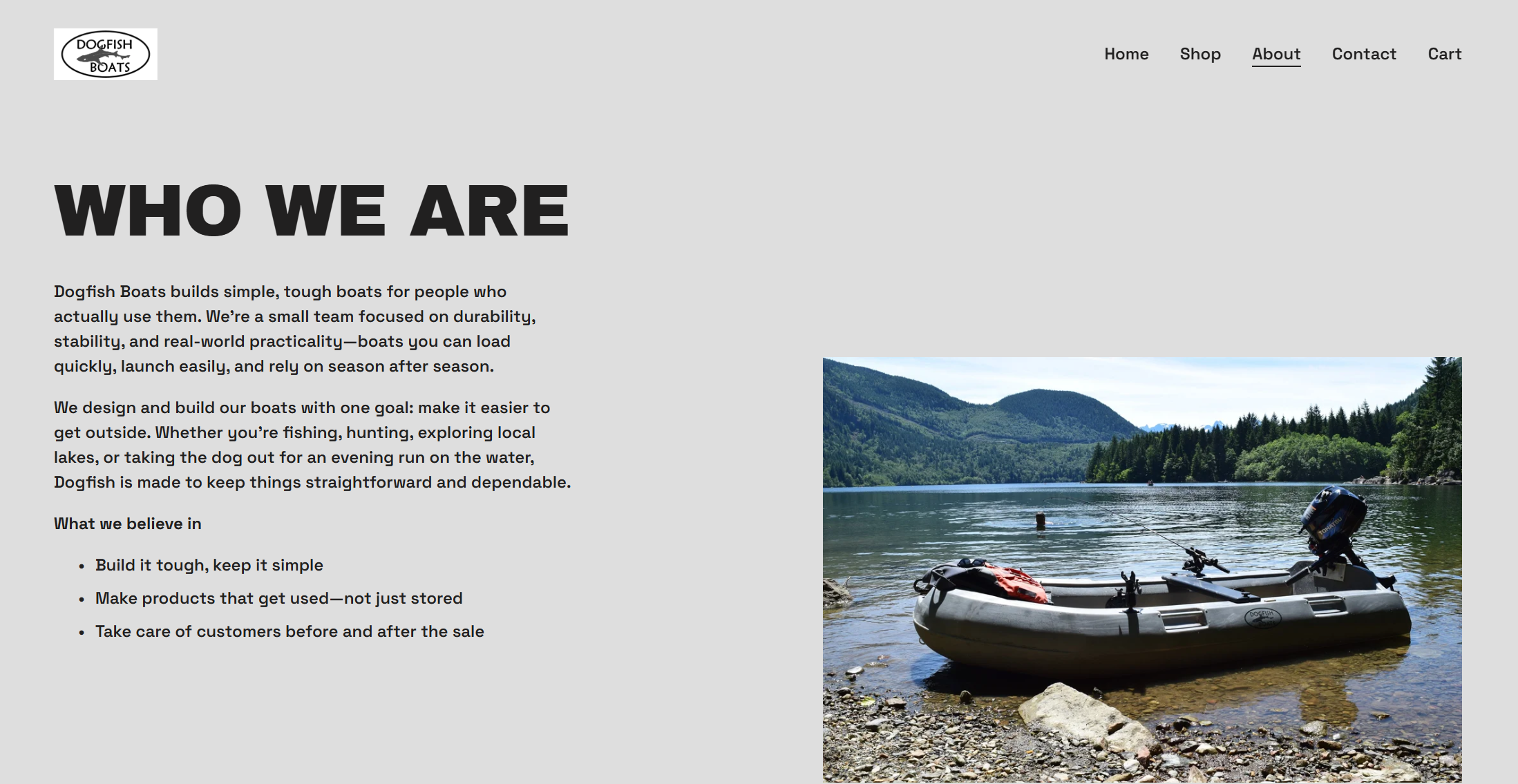
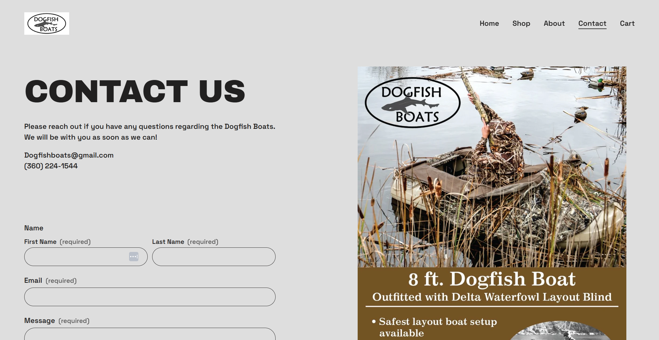
Dogfish Boats was running two disconnected websites simultaneously — an outdated main site hosted on Network Solutions, riddled with PHP errors and broken plugins, and a separate Squarespace store handling purchases. Customers looking to buy a boat were silently redirected off the main site entirely, creating a fragmented, confusing experience that eroded trust and cost sales. There was no cohesive brand presence, no functional checkout, and no clear path from discovery to purchase
The Approach
Before touching the new build, I audited both the Network Solutions site and the Squarespace store to understand the full scope of the damage — broken plugins, outdated PHP, and a checkout flow that sent customers to a completely different domain. The priority was clear: consolidate everything into one cohesive site that could handle traffic, sell boats, and represent the brand properly. With a hard deadline of May 13 — the day before the Bellingham Boat Show — there was no room for scope creep.
Branding assets were designed in Canva and Adobe Illustrator — including a logo delivered in white and grey for flexible use across the site — with page wireframes built directly in Elementor Pro.
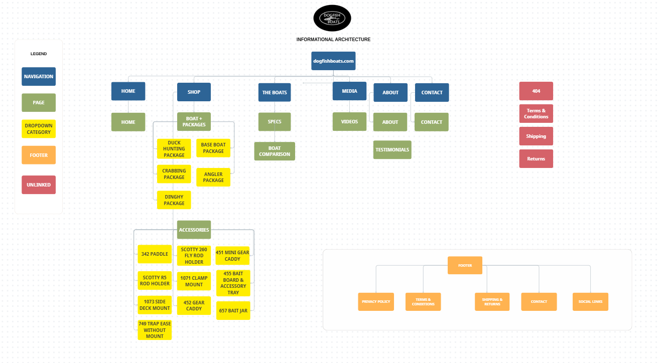
Information Architecture Map in Canva
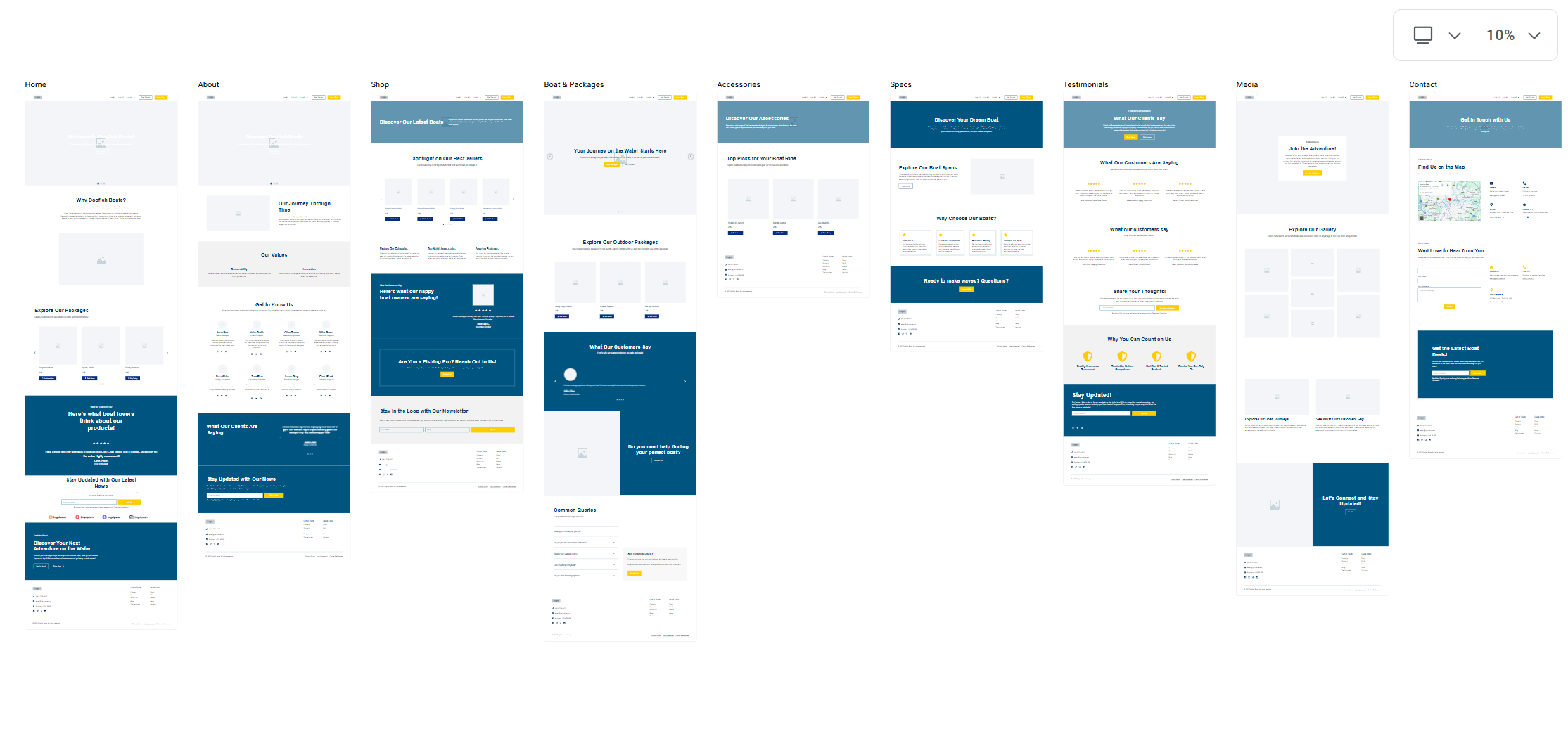
Wireframe Build in Elementor Pro
Design System & E-Commerce Setup
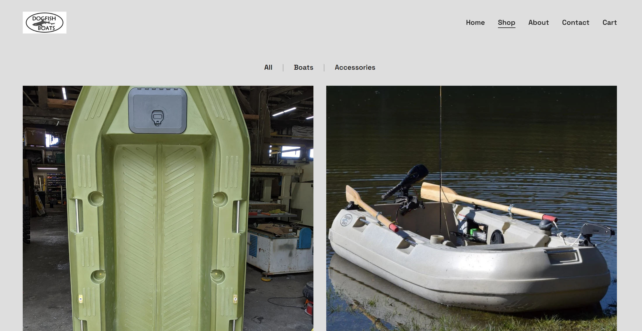
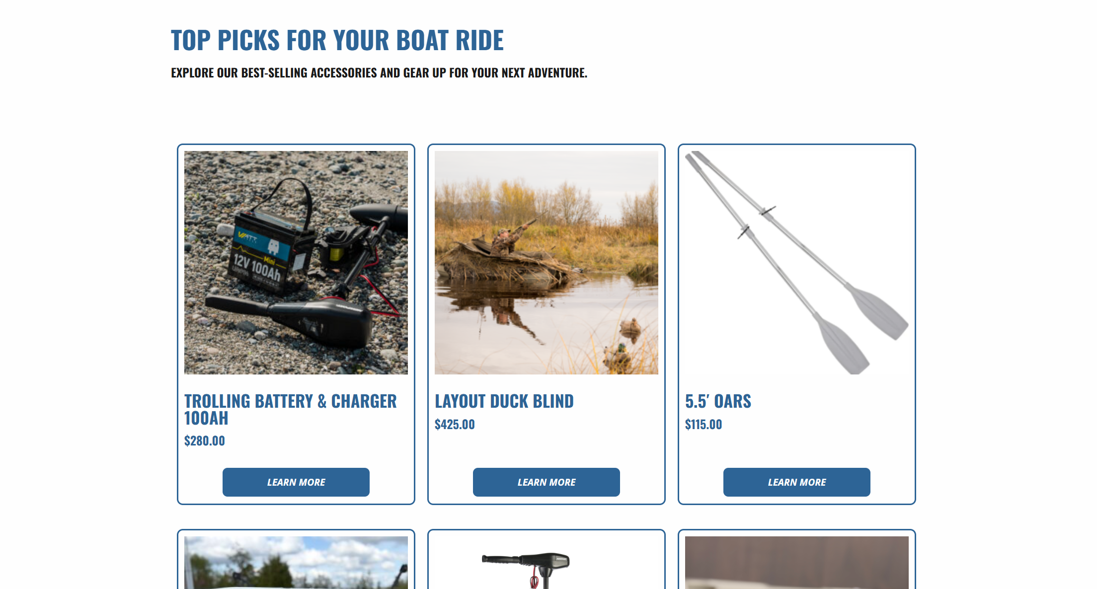
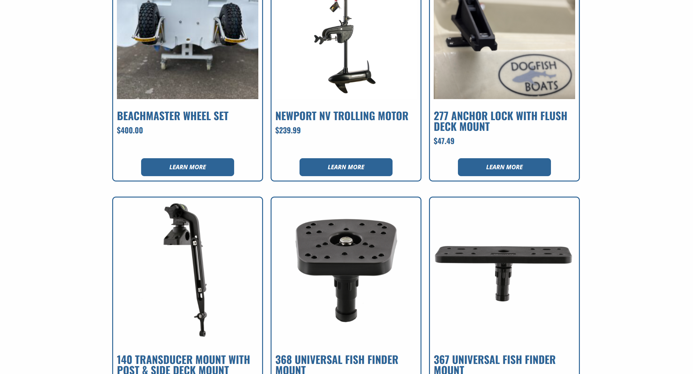
Using Elementor Pro's Atomic CSS editor — introduced in the latest Elementor update — I established a fully responsive design system built on reusable global styles, ensuring visual consistency across all eight pages without redundant styling. All boat products were manually built out and added through Elementor, with the shop configured and connected directly to WooCommerce, giving customers a seamless path from browsing to checkout entirely within the site.
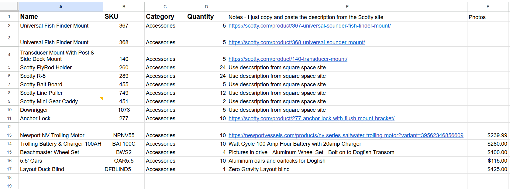
Product Spreadsheet for WooCommerce Implementation
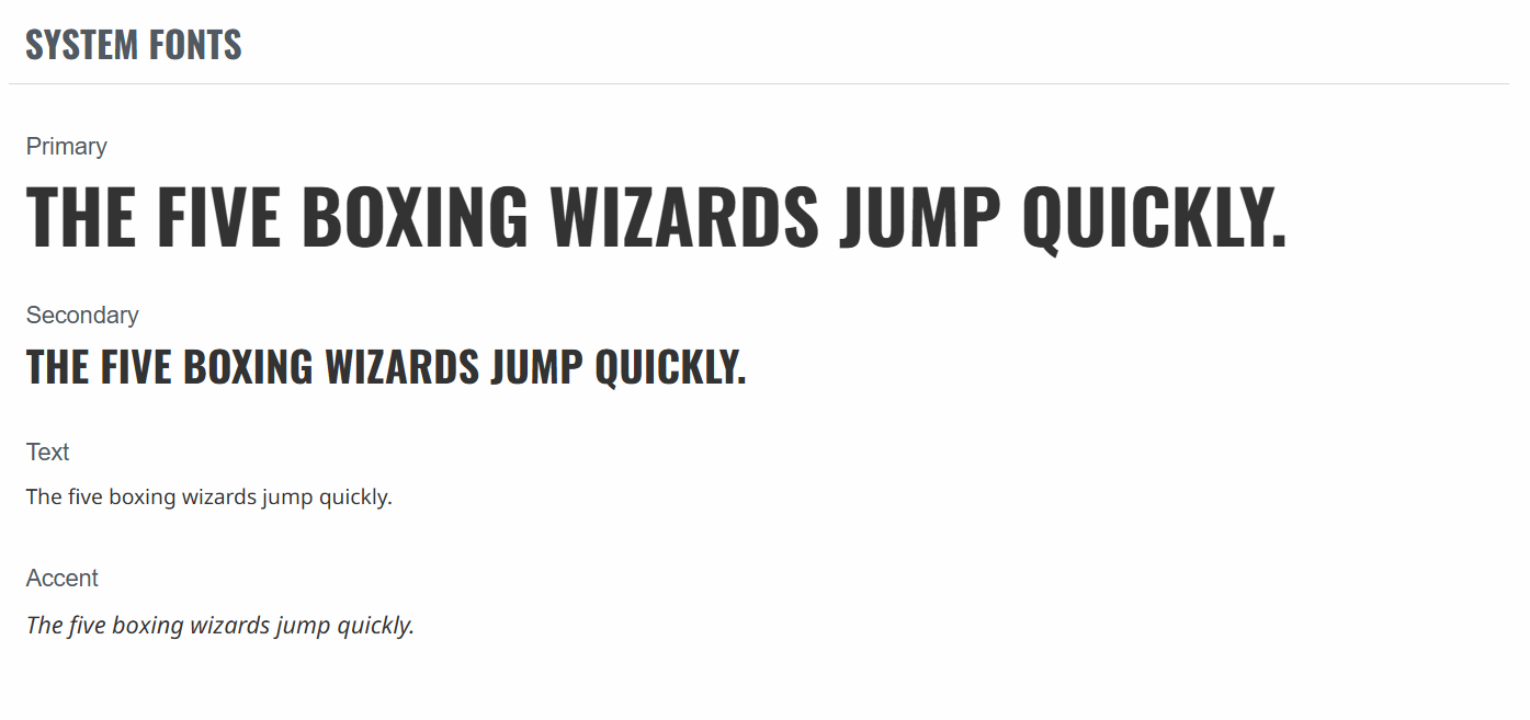
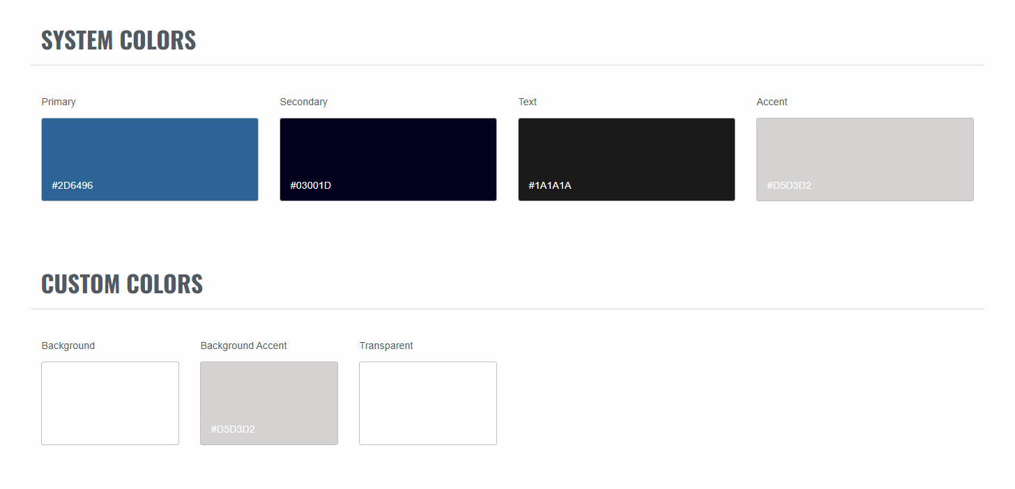
Elementor Design System
The build
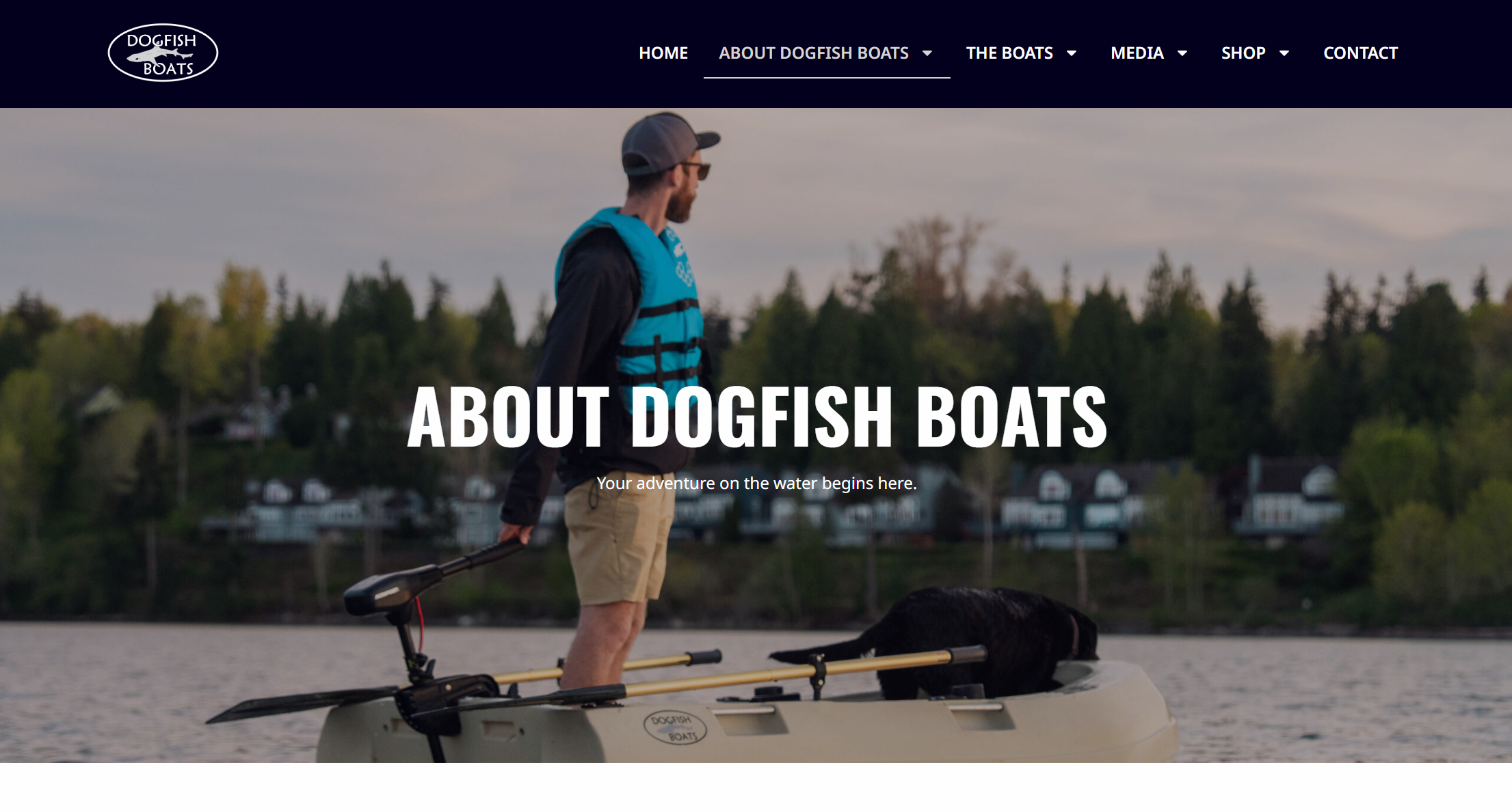
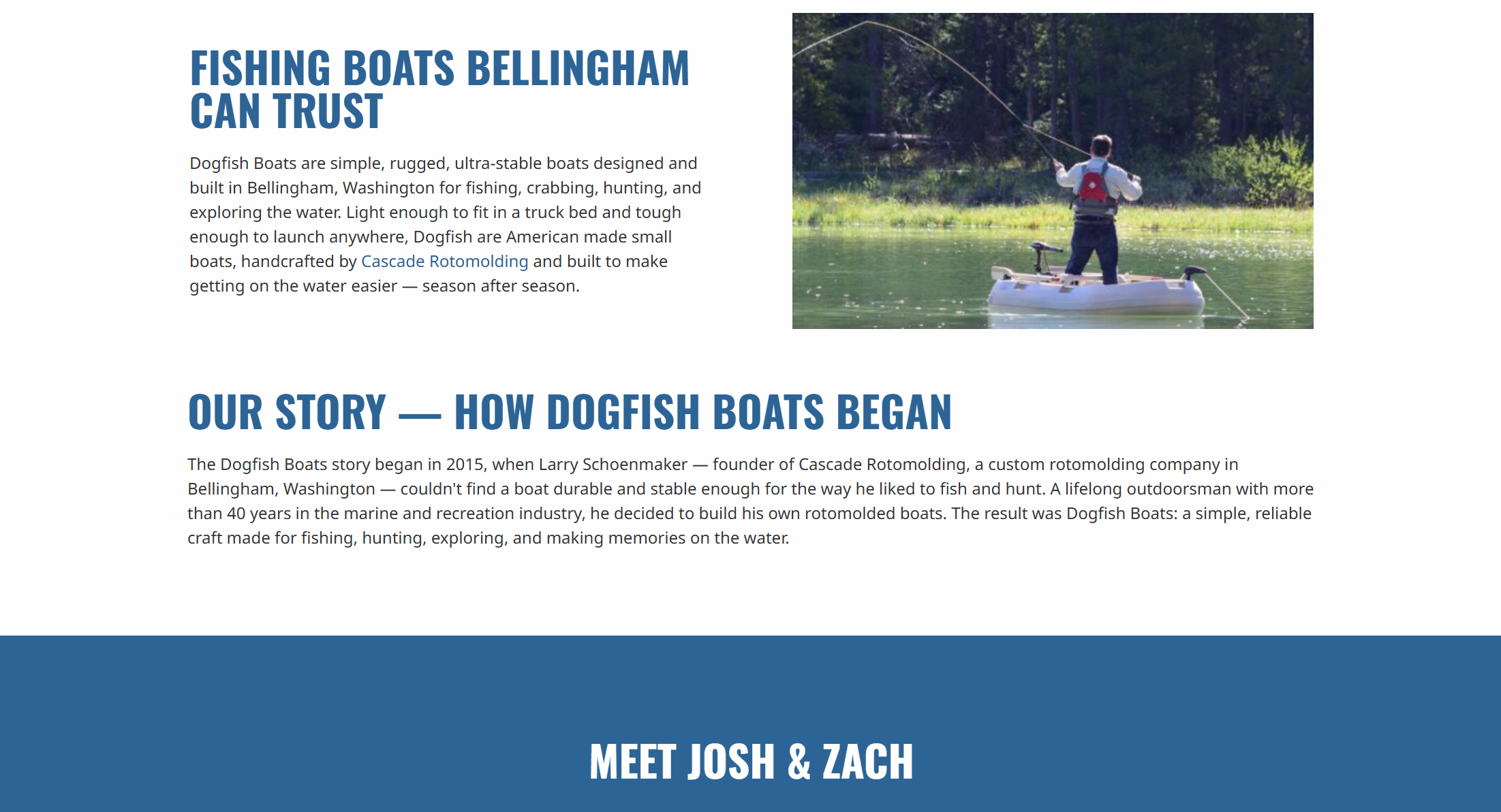
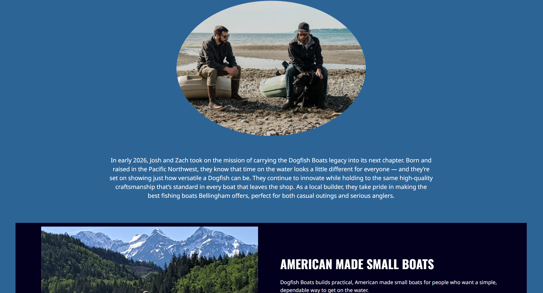
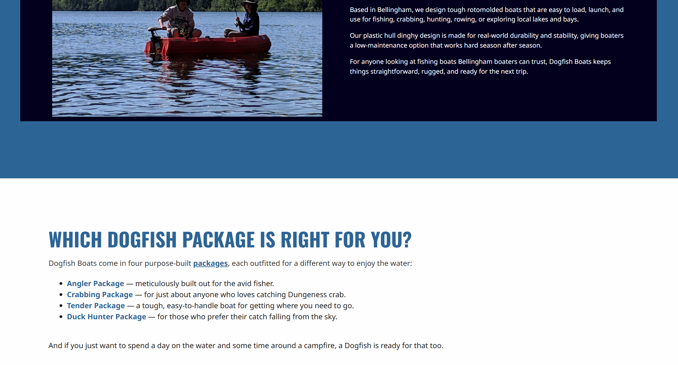
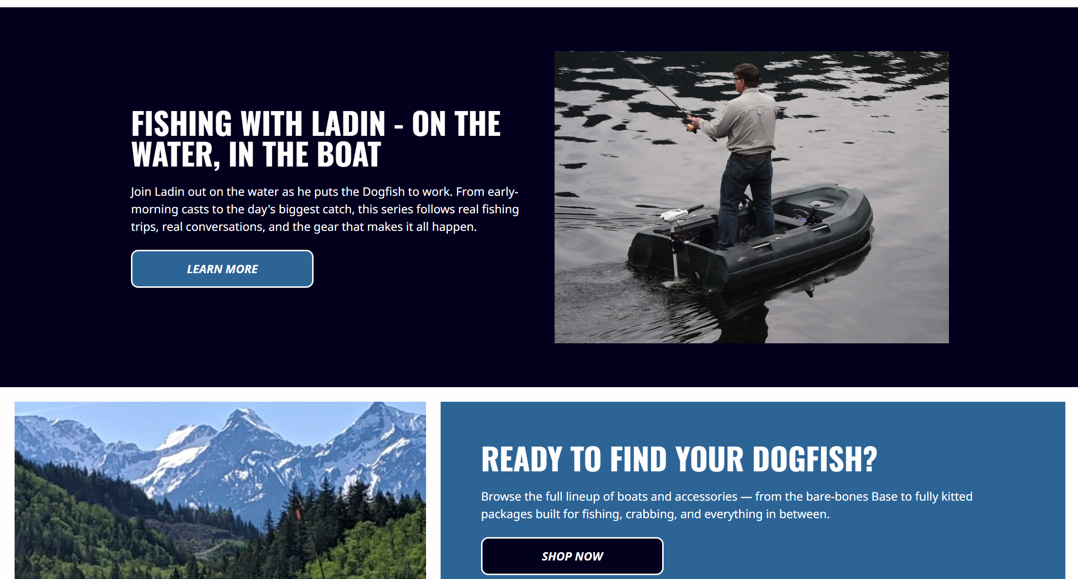
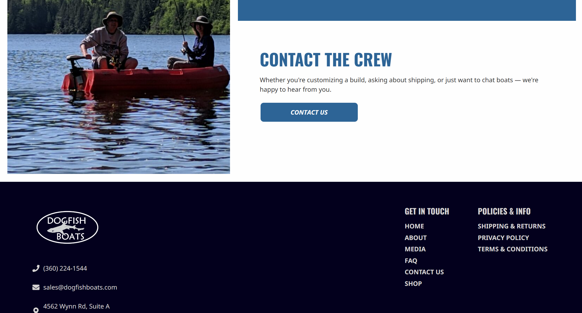
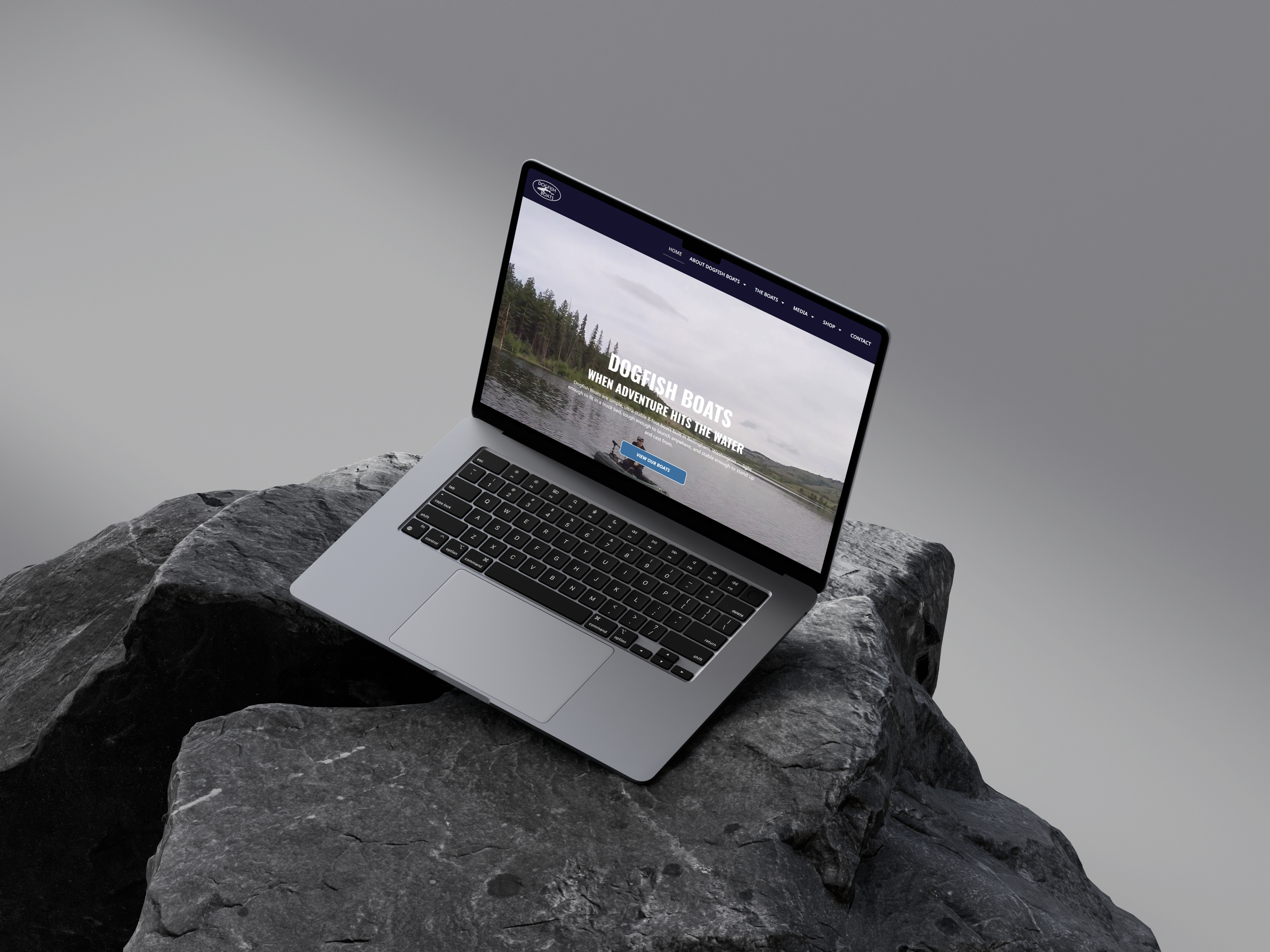
Every page was designed and built from scratch in Elementor Pro, guided by the responsive design system established at the start of the project. The goal was a site that felt cohesive from page to page — consistent typography, a dark and earthy color palette, and bold full-width photography that let the boats speak for themselves. The shop was fully integrated with WooCommerce, with each product manually configured and connected to a live checkout. The result was a complete, purchase-ready website built to perform on both desktop and mobile.
SEO & AEO Optimization
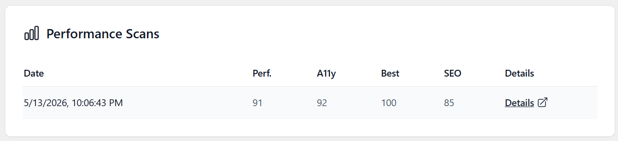
Following launch, I implemented a full SEO and AEO foundation to position Dogfish Boats for long-term search visibility. This included manually optimizing title tags and meta descriptions across all pages, configuring Local Business settings in RankMath with the company's name, address, and phone number, submitting the sitemap to Google Search Console, and connecting Google Analytics for ongoing traffic tracking. To address AI-powered search, I enabled LLMS.txt — a file that helps AI tools like ChatGPT and Perplexity understand the site's content and surface Dogfish Boats in conversational search results. The goal was simple: make sure the site gets found, whether someone is searching on Google or asking an AI.
Warbass Way Marina | Website Redesign
Jan ‘26 - Feb ‘26
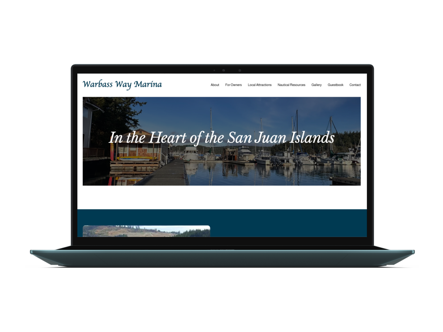
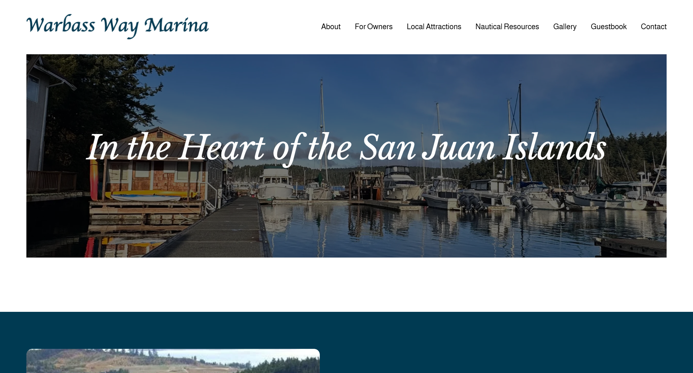
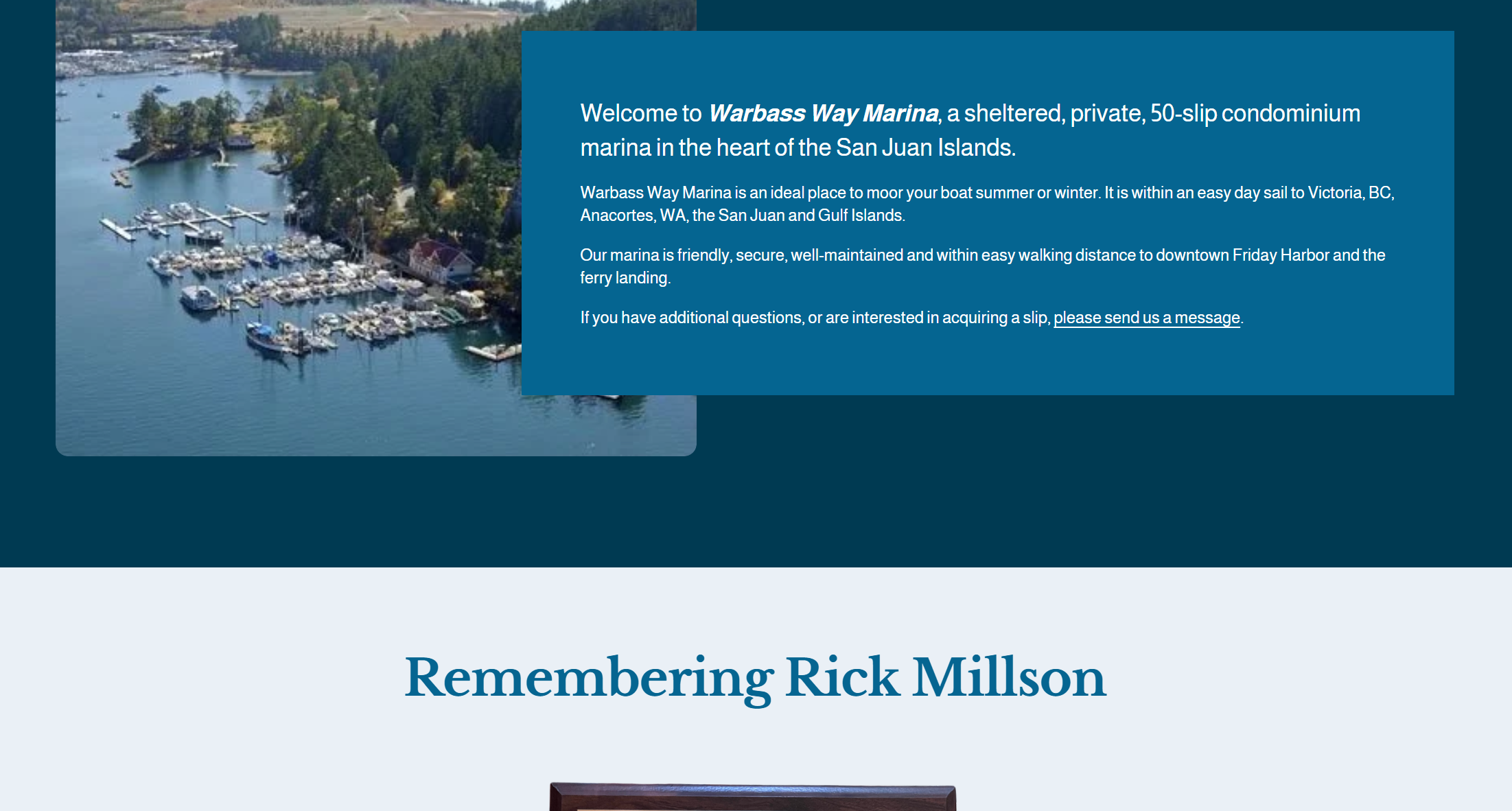
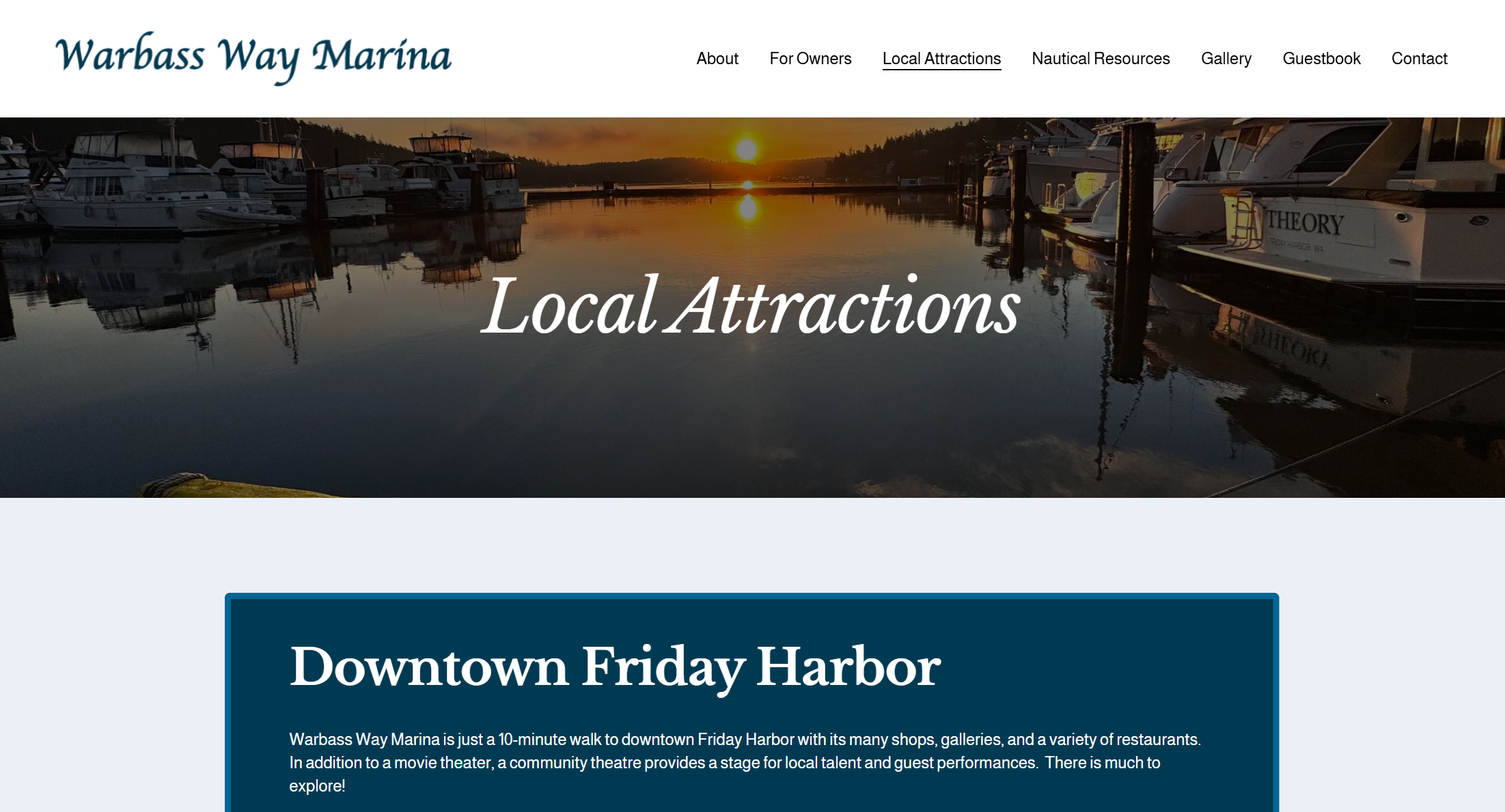
Redesigned the Warbass Way Marina website by migrating the legacy site to a more dynamic, fully responsive Squarespace platform. I refreshed the brand by developing a new logo in Illustrator and enhanced the visual identity through curated photo editing for web optimization. The result is a modern, cohesive digital presence that improves usability and elevates the marina’s brand.
The Old Site
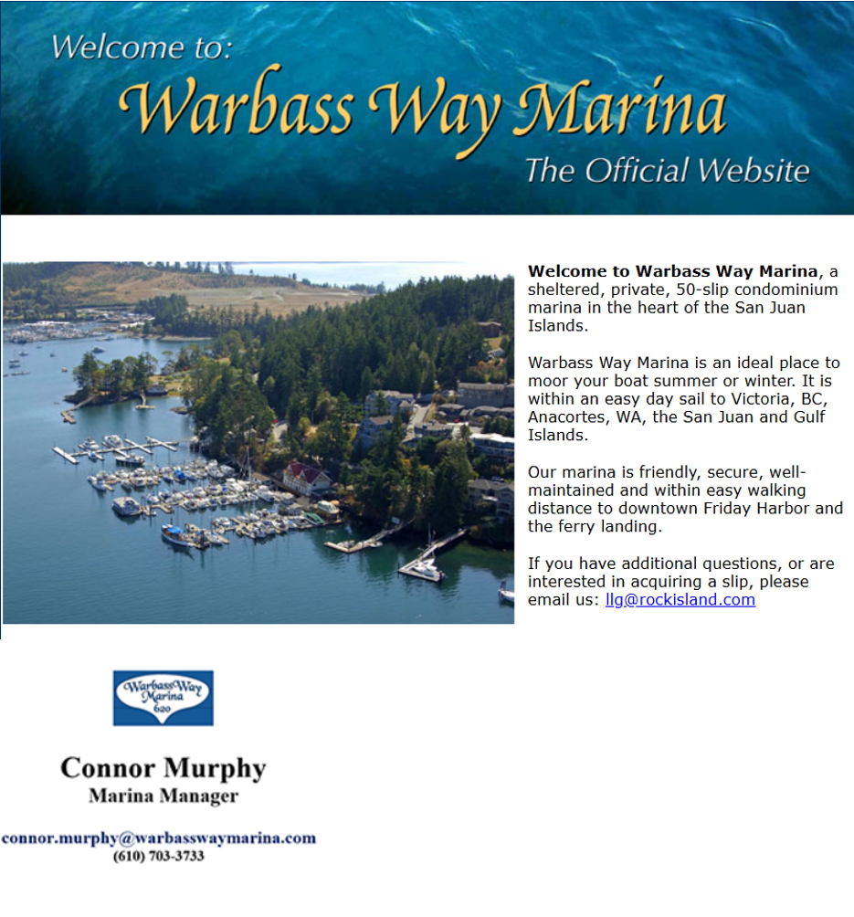
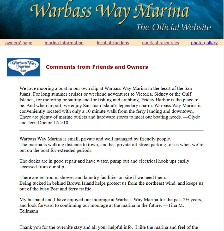
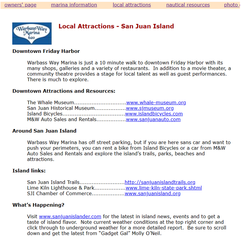
The previous website was significantly outdated and built in plain HTML, lacking a structured content system or cohesive formatting standards. Pages were text-heavy, with large blocks of unformatted content that made information difficult to scan, navigate, and understand.
Without a clear hierarchy, consistent layout patterns, or organized structure, users had to sift through dense content to locate essential information — creating friction in what should be a straightforward civic experience.
The Redesign
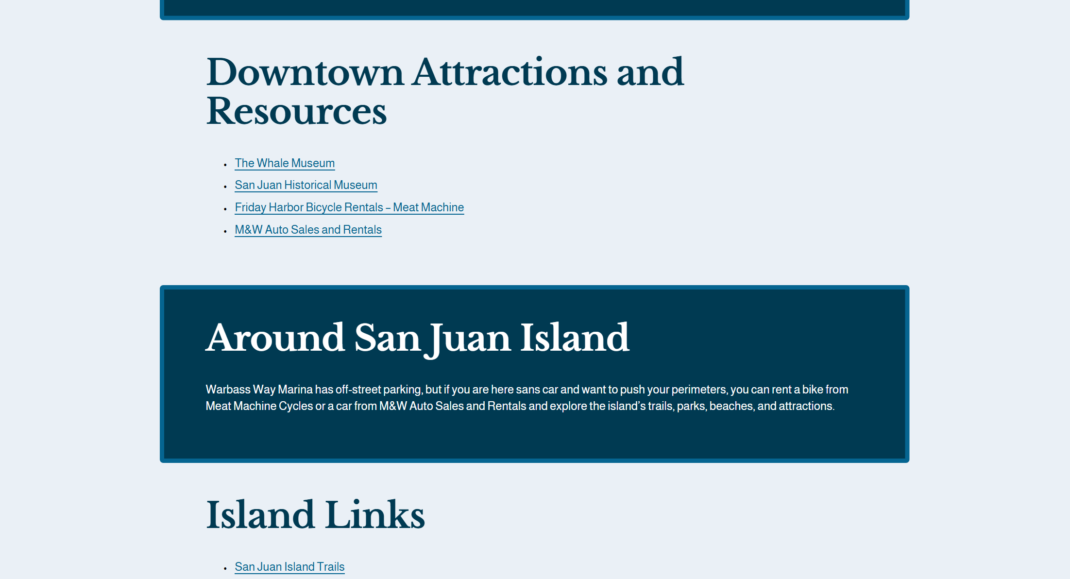
The redesign introduced a fully responsive system, ensuring a seamless experience from desktop to mobile. I implemented thoughtful typography pairings to establish clear hierarchy and improve readability across long-form civic content.
A refreshed color palette was developed to create visual cohesion while maintaining accessibility standards. Content was reorganized into structured, scannable sections with consistent spacing and layout patterns — resulting in a digital experience that is both visually cohesive and intuitively structured. Check out the new site here!
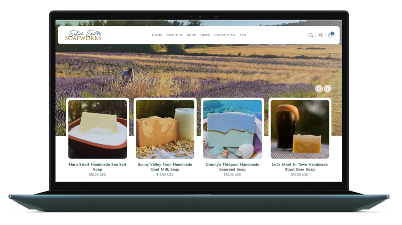
Salish Sea Soapworks | Shopify Website Development
Aug ‘25 - Nov ‘25
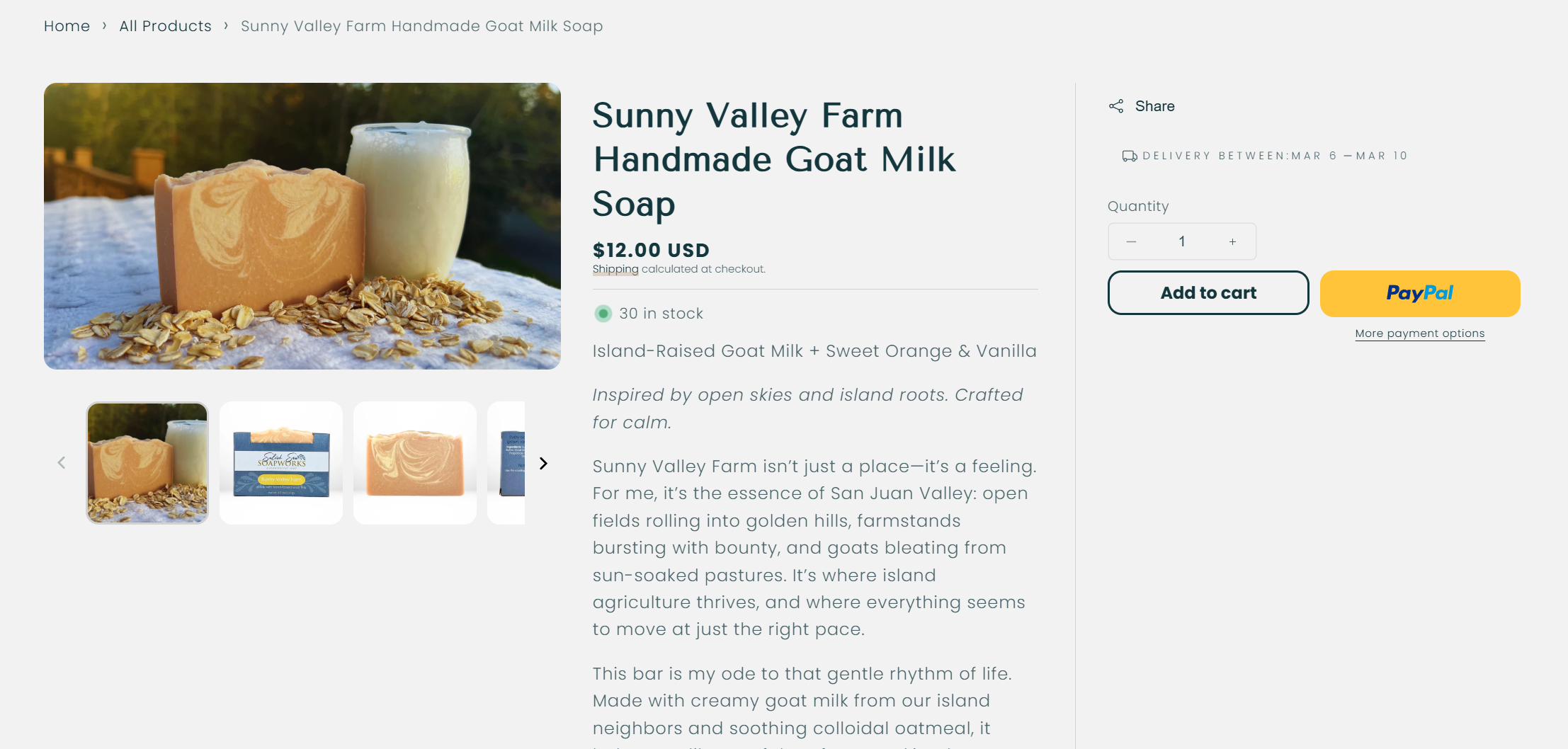
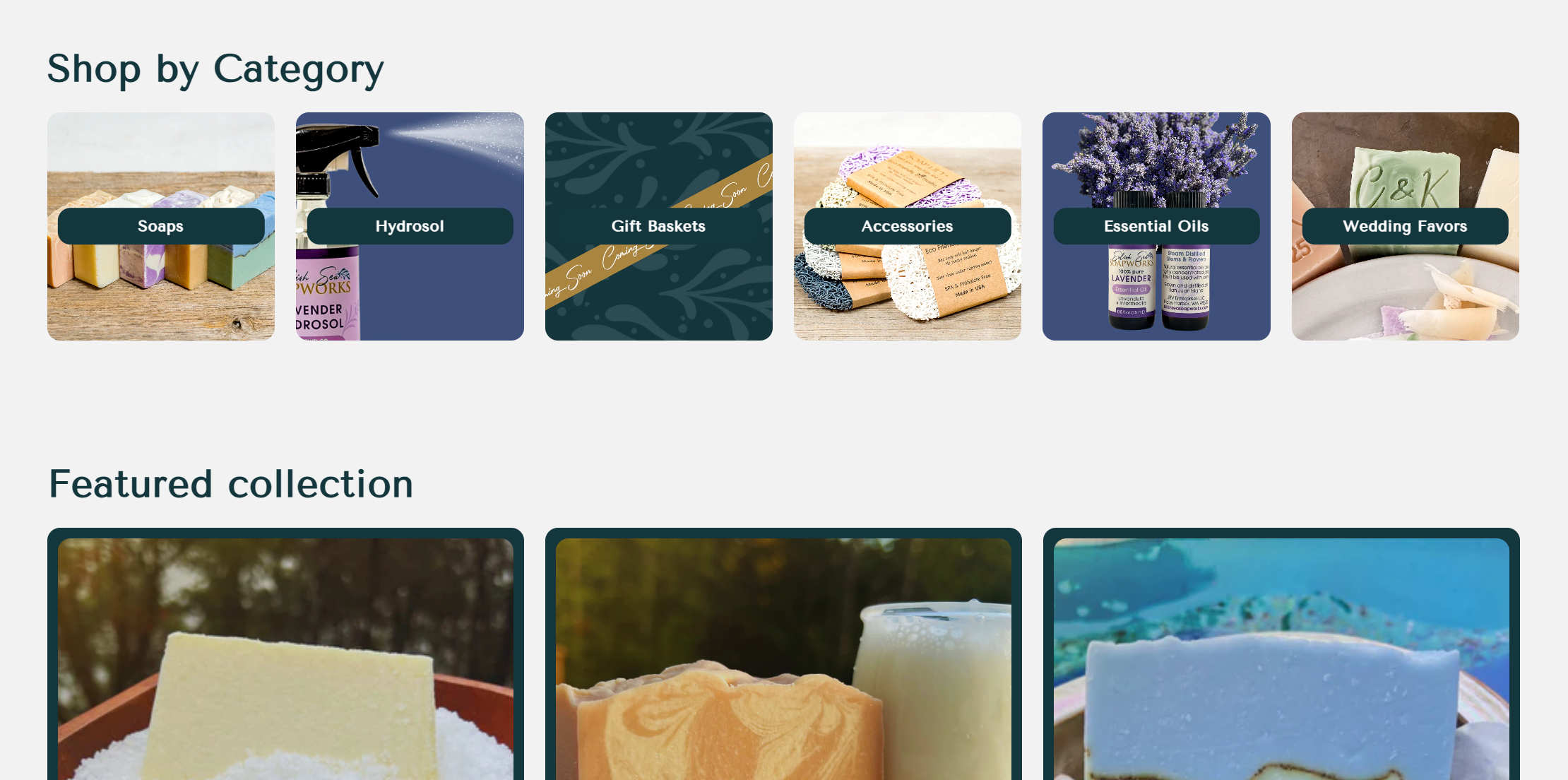
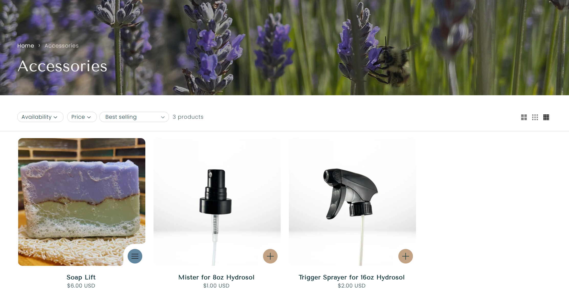
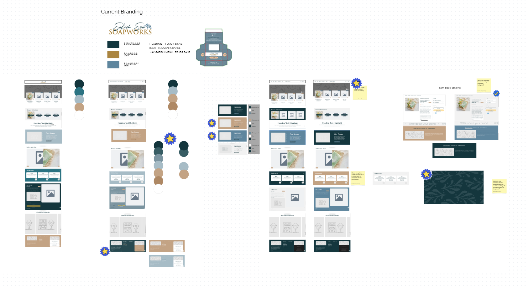
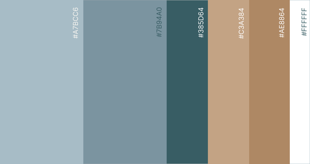
Developed the Salish Sea website from the ground up in Shopify, crafting a cohesive brand presence alongside a fully functional e-commerce platform. I established the color palette, refined the visual direction, edited product photography, and created custom graphics to ensure a consistent and elevated digital identity.
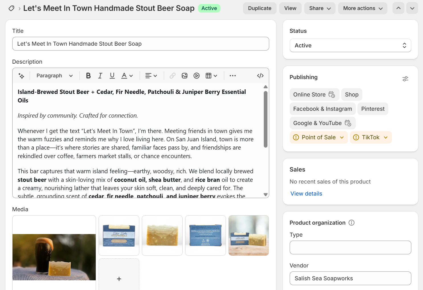
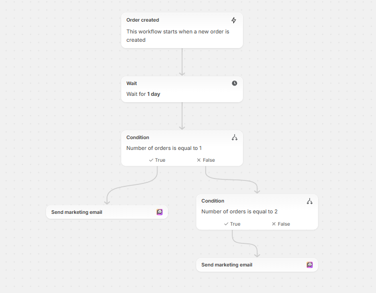
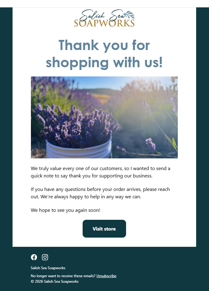
On the technical side, I customized page templates using Liquid code and implemented custom metafields to enhance how product information is structured and displayed. I also built marketing automations and optimized site performance through Google Search Console to support visibility and long-term growth.
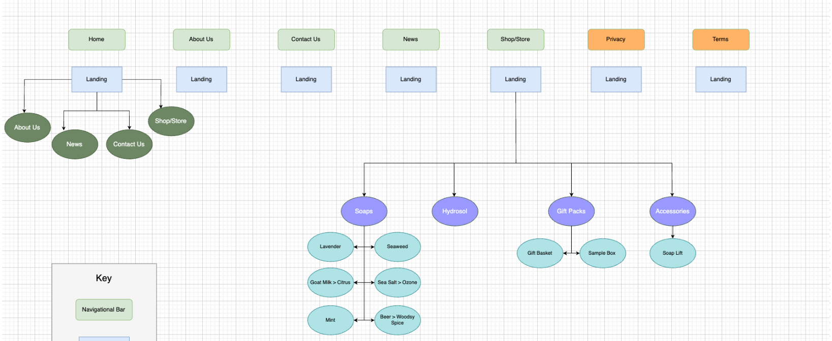
Sitemap
Design Brainstorming
Color Palette
Custom Phots + Copy Implementation
Marketing Automations
The Impact
The new website positions Salish Sea Soapworks as a premium, thoughtful brand while maintaining its approachable, handmade charm. The updated structure improves user confidence, supports conversion, and creates a cohesive digital identity that aligns with the brand’s values of sustainability and quality. Check out the new website here!