NITECAPP UX DESIGN INTERNSHIP
Role: UX Design Lead
Duration: Jun 2025 - Sept 2025
Tools Utilized: Figma
Project Type: Mobile

Background
Nitecapp is a digital platform connecting hospitality operators, beverage suppliers, and frontline staff through training, communication, and sales tools. As the sole UX Designer for its “coffee” and “checklist” features, I led research, user flows, and interface design in Figma—leveraging my barista experience to create intuitive, real-world solutions aligned with Nitecapp’s mission to empower hospitality professionals with tools and education to succeed today and thrive tomorrow.
PROBLEM
Challenge | ‘coffee’ feature
The coffee feature of Nitecapp was limited to two basic screens, with no options for sizes, flavors, or custom components. This made it unrealistic for cafe workflows and limited its value for training and daily use.
Challenge | ‘cHECKLIST’ feature
The checklist tool only supported a single form of tasks, lacking flexibility for different inputs such as buttons, short entries, ratings, or photos. This limited its ability to support onboarding, training, and daily operations in a dynamic hospitality environment.
The OLD INTERFACE


Coffee Feature | Fig 1, Fig 2


CHECKLIST Feature | Fig 3, FIG 4, FIG 5
RESEARCH
I grounded my design decisions in first-hand experience as a barista, giving me unique insight into how staff manage menus, tasks, and efficiency in a fast-paced café environment. To supplement this perspective, I also reviewed competitor apps and gathered informal feedback from industry peers.
Key Insights
Menu simplicity vs. completeness → staff need quick access to sizes, flavors, and modifiers without clutter.
Task flexibility → operations require varied inputs (buttons, notes, time-based reminders) beyond rigid checklists.
Efficiency under pressure → features must minimize steps, reduce errors, and support staff during rushes.
Impact
These findings shaped my design approach, ensuring the café and checklist features weren’t just functional but aligned with the realities of working behind the counter.
Quote From the CEO
“Our priority is creating tools that actually make life easier for the people using them day in and day out. We wanted the coffee and checklist features to feel intuitive and supportive for staff, not just functional on paper.”
IDEATION
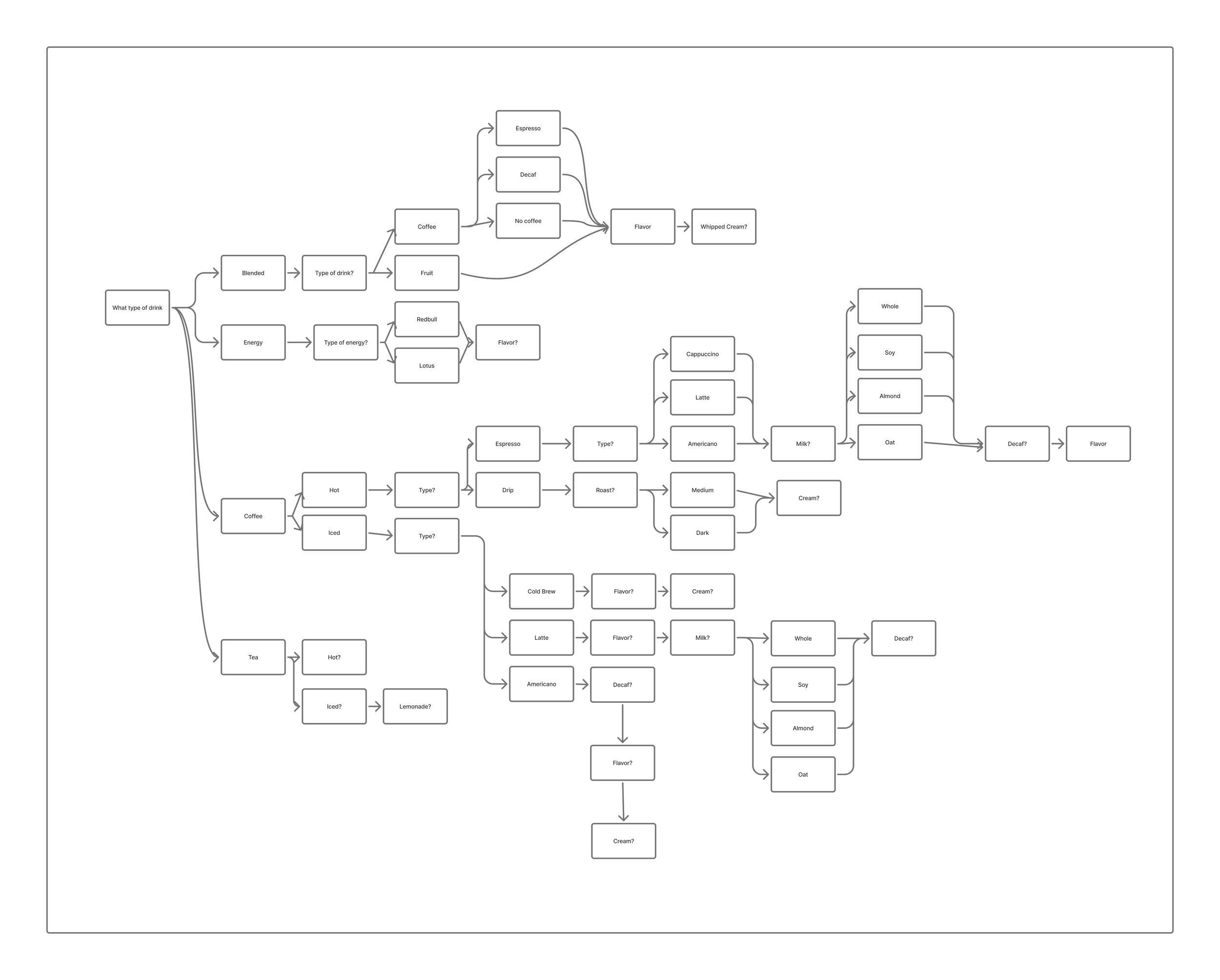
Hierarchical Flow map
Brainstorming necessary variables to implement into the coffee feature and the flow of information varying from drink to drink.

User Journey Map | Ai Features
My employer wanted to explore ways to implement artificial intelligence into the coffee feature so I built out a user journey map for brainstorming various implementation ideas.

Low Fidelity
For the coffee feature in the mobile app, I created digital low-fidelity wireframes. For the checklist I created sketches of the user-side of the interface.
COFFEE FEATURE - User Side
The goal was to make the café menu easy to navigate so staff could quickly select drink variations (size, flavor) and use drink cards to engage with customers. Key features included:
Dropdown for size selection → dynamically updates calories, price, and roast type.
Dedicated roastery page → highlights origin and roasting details.
COFEE FEATURE - Admin Side
The admin dashboard allowed managers to:
Add new drink categories
Assign task types
Manage staff-facing content

CHECKLIST FEATURE

First iteration | COFFEE
In the first iteration of the user-side wireframes, I focused on making drink and roast information clear and engaging. Each drink page included size options, ingredients, and preparation steps, while roast and roastery profiles highlighted tasting notes, origins, and recommended pairings. To support learning, I incorporated space for video tutorials and tagged content. This approach emphasized education and storytelling, connecting users not just to the product but to the people and processes behind it.
User Side

Admin SidE
I designed a step-by-step flow for adding drinks, breaking tasks into stages (info, ingredients, method, presentation, tagging). This structure reduces errors, keeps the process efficient, and allows flexibility through variables, custom steps, and optional media uploads.

REBRANDING
Midway through the internship, the team introduced a refreshed brand identity, shifting from a neutral grey-and-black palette to a warmer, more inviting color scheme paired with a modernized typeface. This update aimed to create a stronger emotional connection with users while improving readability and accessibility across the app. I adapted my wireframes to align with the new system, ensuring consistency in hierarchy, color usage, and overall visual tone.


SECOND iteration | COFFEE | NEW BRANDING
In the second iteration of the user-side wireframes, I refined my designs to create a more polished interface that improved clarity and overall usability. I also added the ability to view a photo/video for each step of the recipe, changed the layout to be more intuitive, and implemented the design for an AI chatbot which would be a learning model trained to assist baristas with coffee-related questions and prompts.
User Side

Admin SidE
The old layout of the admin side of the app sported a popup on the righthand side for adding a copy. After some discussion, we agreed that it made more sense to have the popup in the middle of the screen for usability purposes, so this new design is adapted to the center layout of the popup. This new design also includes the ability to add a photo and video for each step of the recipe of a coffee, a search feature for the roastery and coffee beans, and all important associated information about a drink.

Checklist Feature | NEW BRANDING
I added 8 additional forms of input for the new checklist feature, this included methods like ‘signature’ ‘multiple-choice’, ‘QR Scanner’, and a few more useful input methods.
User Side


Admin SidE
On the admin side this meant figuring out a way to represent each of these input methods. I chose to go with icons which I believe made it simple and easy to identify the current input method. It was important to make the admin side clear and simple, since this is where the checklist for the baristas would be setup. I would present 2 options to leadership and the development team for adding a new task. One would consist of a popup consisting of selecting a task type, and filling out the task information. The second option would be selecting the task type on the popup, then filling out the task information inline on the general screen. To go back into edit mode, the user would click on the task type icon or the edit button.

Checklist General View

Checklist Adding a New Task | Option 1 | Popup
Checklist Adding a New Task | Option 2 | Popup With Inline text Input

REFLECTIOn
My internship at Nitecapp strengthened my ability to translate real user needs into clear, intentional product decisions. Working on the cafe side of the app helped me connect my barista experience with UX best practices, allowing me to design workflows that support both customers and baristas. I gained hands-on experience conducting user research, mapping user journeys, and exploring opportunities for AI-driven features. Overall, I left with a stronger understanding of how to design within a multi-user ecosystem, communicate ideas effectively, and iterate based on feedback.


